
As a longtime Squarespace user, I’ve been dreaming of an eventual upgrade to their already-great drag-and-drop editor. Well, Squarespace has answered my prayers! They recently announced Fluid Engine, their new drag-and-drop editor, and I’m already in love.
Here’s everything you need to know about Fluid Engine’s interface, plus a few glitches to look out for.
TRANSCRIPTION: What is Fluid Engine? And Should You Upgrade Your Squarespace Website?
There has been some very big news in the Squarespace world lately. In case you missed it, Squarespace just launched their brand-new drag and drop editing experience called, Fluid Engine
in this video, I’m gonna go over everything you need to know about Fluid Engine, how to know if you have access to it, the basics of how it works. And some things need to be careful of if you want to switch from the 7.1 classic editor to using Fluid Engine moving forward.
Hi, I’m Galen from Local Creative Co. I’m a web designer as well as an online educator. And this news was super exciting to me, and I can’t wait to help you navigate it, as I navigate it myself. Keep in mind, this editing experience is brand new, so things can be changing rather quickly. I will try to make future videos about this topic as updates come.
So, that way we can both stay up to date together.
If you’ve already had a chance to play around with Fluid Engine and test it out on your own website, let me know in the comments below what you think. I am dying to hear your thoughts.
Before we dive in, you might be thinking Squarespace already had a drag and drop editor, basically, meaning you could add blocks to a page block for images blocks for text blocks for pretty much anything. Squarespace has a wide variety of blocks and it’s one of the reasons I love their platform so much.
You could add those blocks to your page, and then yes, technically you could drag and drop the blocks around the page to put them exactly where you want them.
The problem was you couldn’t put them exactly where you wanted them.
With the classic editor, which has been the standard Squarespace editor up until they came out with Fluid Engine. The one you’ve come to know and love for several years now, with that version of the editor, you were really stuck to Squarespace grid system. You could put elements above other elements below them or on either side, but that was pretty much it.
You were really limited when it came to creating overlapping elements or elements that would stick to the side of a particular section.
There was beauty in that simplicity though. So, many people loved that editing experience and loved how simple Squarespace made it to build beautiful websites. And while I think this will enhance the experience, I think it’s gonna be a transition for a lot of people and they’ll need to take some time getting used to this and being able to build websites with this new format.
The big thing I think Squarespace is trying to do here is become more competitive with platforms like Wix or Showit that have that added flexibility because you can really move elements anywhere on the page.
Before we dive into how Fluid Engine actually works, let’s talk about what the transition process looks like. How do you even know if you have access to Fluid Engine already? And if you don’t, what can you do to get access to the new editor?
If you started your website design after July of 2022, you are automatically using the new Fluid Engine editor. But if you had your website started before that point, you are likely using the classic editor on 7.1 or Squarespace. 7.0
if you are using Squarespace 7.0, you will not get access to the Fluid Engine editor now, and you may not get access to it at any point in the future, either. Squarespace is really focusing on 7.1. So, you’ll need to migrate your site to 7.1. If you want to start using the new editor.
If you need any support, migrating your site from 7.0 to 7.1, this is actually a service that my team and I offer. So, feel free to reach out on our website. I’ll leave a link to my web design page in the description below.
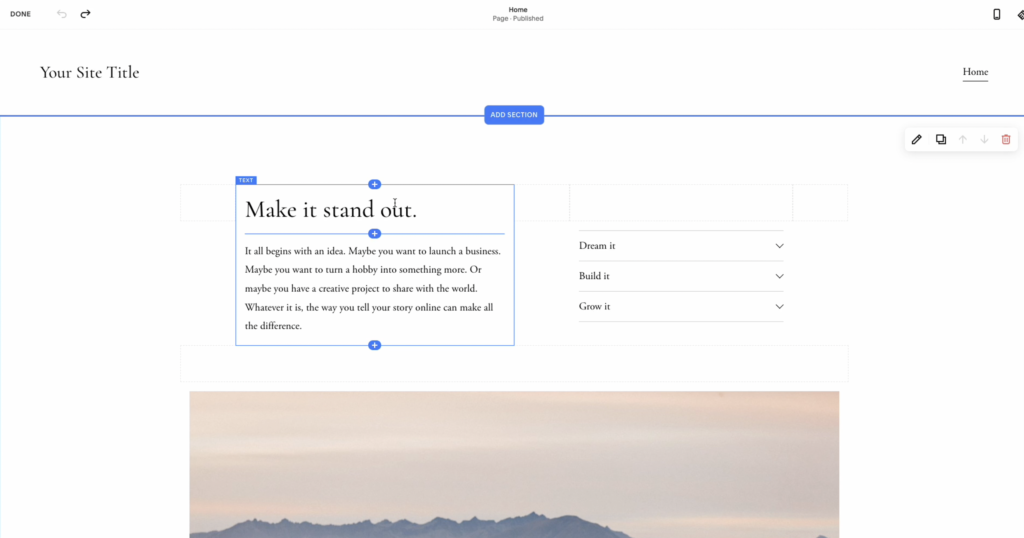
If I pull up a demo site here, I can tell that I’m using the classic editor, because if I click on a block and drag it around the page, you can see I’m pretty limited with where I’m able to place it again. I can place it above the content below the content, to the left or to the right of the other content on the page, but that’s pretty much it.
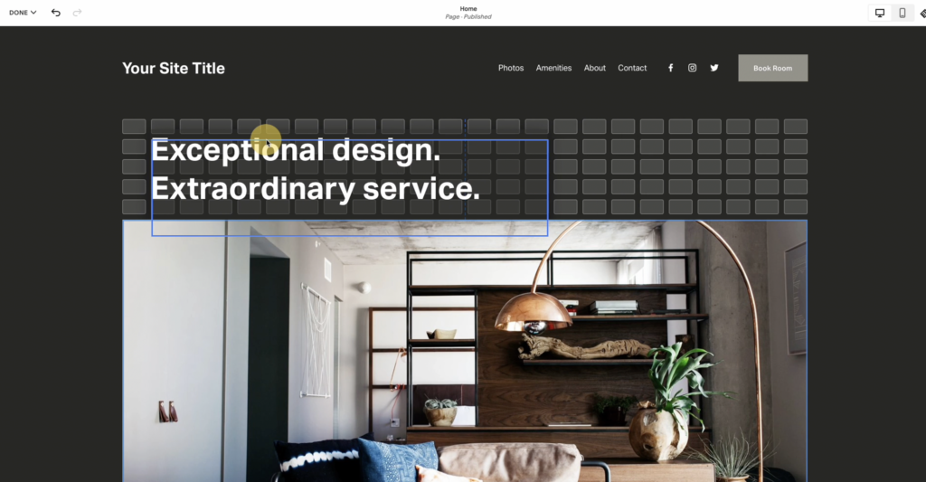
if I click over to this other demo site that I’ve created and I click and drag a block, you see this new visual grid pops up. And this allows me to be really flexible with where I place my content. I can virtually place it anywhere that I’d like to on the page.
I can still edit the content, just like I would in the classic editing experience. But now I’m able to do so much more when it comes to resizing each of the blocks on the page and layering them on top of each other.
So, for example, if I want this heading on top of this image, I can just drag it down here and then I’m able to adjust the layers to bring this layer forward. So, that way the text is showing on top of the image, rather than behind it.
I can also click the pencil icon here to bring up some additional settings, and I’m able to add a background that makes the text a little bit easier to read.
I can add some custom padding. I can adjust the corner radius of the background shape. This is so much more flexible. And I know a lot of people struggled in the past to make these designs with the previous editor.
I’m just going to play around with this a little bit and move the text so that I have it exactly where I want it to be.
I’m going to center this text.
You can see, we have some new align options here. I’m able to align it vertically. So, that way the text is perfectly centered in the background color that I’ve given this particular block.
If I’ve got a little extra space at the bottom of this section, I can click this here. And I’m able to just drag this up to get rid of that extra grid space that I don’t currently need.
I’m able to add new blocks to this section, just like I would have in the classic editor. You’ve still got the same blocks that you know, and love with Squarespace here. There’s just so much more flexibility to where you place them and how you organize all of the content on your page. So, I can come in here. I can browse some stock photos and just to keep with the interior design team here.
Add an image from Unsplash.
And there we go. Not the best layout I have ever designed, but just want to show you how easy it is to move elements around, to arrange them. So that way you’ve got certain elements above other elements and you can kind of control how this all looks. Another thing to note is that if I were to start to stretch out a particular image on the page, I can come into the settings for this image.
And I am able to come over to design and choose between whether I want to fit the entire image within the box that I’ve created for it, or do I want to fill it? So, that way the image actually will fill the shape that I’ve created, or I will fill the grid space that I have created for this particular image.
So, I can move this around and maybe I want this behind the text here. So again, not a great example, but it just shows you some of the flexibility.
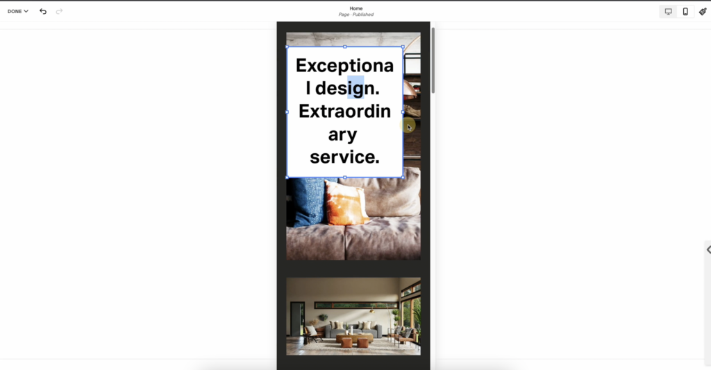
I’ve got a popup here in the top, right? This is telling me that I need to now redesign this same layout on the mobile view of my site. This was sadly one of my favorite things about the classic editor within Squarespace. You could design something on desktop and it pretty much looked great on mobile.
I personally know and use custom CSS for pretty much all of my Squarespace websites. So, I didn’t mind taking the automatic mobile layout that Squarespace created and customizing it a little bit with some CSS to get it, to look exactly how I wanted it to. But now there’s quite a bit more work involved and actually manually moving around the elements in your mobile design.
Because right now, even though all the elements are there in the mobile design with the new Fluid Engine editor, you still have to move them around the page to get them to show up how you want them to you.
So, let’s click okay here and let’s look at the mobile design. So, you can see again, the elements are here, but they don’t really look great. Both images are here, but this image is no longer a background. So, you’re going to have to move these elements around on mobile, just like you did on desktop to create the same look and feel.
So, now I’m gonna move this back. I’m gonna pull this up here. I might size this down a little bit, and this might be a way that I, or this might be a, something that I still use custom CSS. And you can see it’s a little bit finicky here. I’m not able to get it to look exactly how I want it. I could resize this, but then it’s going to resize this on the desktop version as well.
So, some of the changes you make on desktop are going to cross over to mobile. And other changes that you make on desktop will not. So, like positioning of the elements that is going to be either specific to desktop or specific to mobile, but size or color, things like that. That is going to be the same on both devices.
Now, that I’ve got it looking more along the lines of what I’d like. I wanted to show you some other cool features and settings. One thing that you weren’t able to do before that you can do now with Fluid Engine is you can have elements that extend to the edge of the page. So, you can see here, you were able to do this with a background image, but I have so much more control over how far do I want it to go to the edge of the page?
And then I can have elements below that that are overlapping it or on top of it that are overlapping. It. There’s a lot of flexibility here that you didn’t have before.
But with that, at least for now, there’s a little bit of glitchiness in there too. I actually had one time while I was editing this page for this video where I had to refresh the page because it stopped functioning and I got an error and I lost all of the changes that I had made. So, while it’s still new and this is just a good, best practice in general save often.
So, that way you don’t lose anything you’ve been working on.
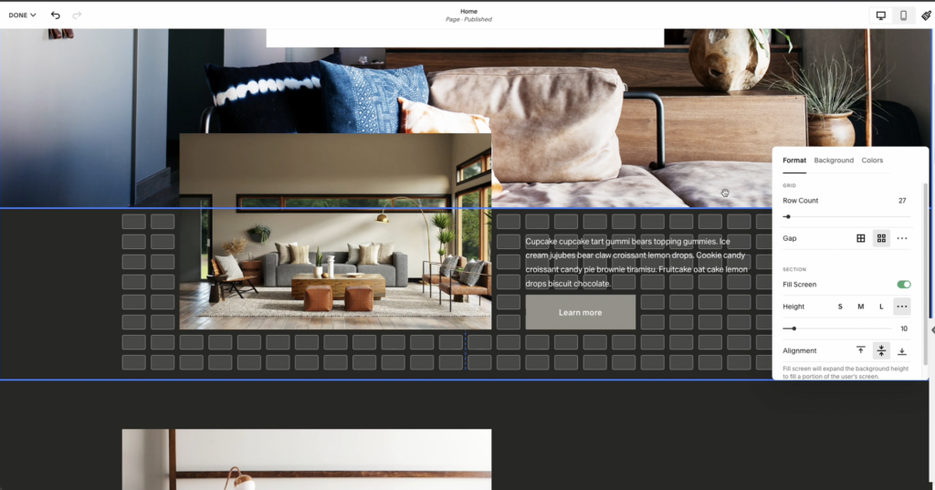
As you play around with this, I recommend you go into the section settings because this will give you so much control over the grid itself. I love that Squarespace uses a grid system for its new drag and drop editor because so many drag and drop editors don’t and it helps you build a website that just feels that much more balanced and symmetrical
Here. I’m able to adjust the spaces between the grid, columns, and rows. I am able to control the height and I’m able to control actually how many rows of space I have in this particular section.
You can still add a background image or video to your sections. You can still change the colors. This part hasn’t changed. The main thing is just this new grid system and the ability to overlap elements and to move them around independently.
And as a group, I’m actually able to select multiple elements and move them together. So, I just selected this image here. I held down the shift key. Then I selected this heading, and I can actually drag these together so that the two are sort of grouped together. This is really helpful for when you have an image with text next to it, and you want to move that independently from other elements on the page.
Being able to move elements freely, like this completely eliminates the need for spacer blocks, because if one element is a little bit too close to another, you can just drag it and move it around to create the space you need to get your design exactly how you want it.
Now, that I have the top section of this homepage looking pretty good on desktop and mobile view. I wanna talk about a few other pages that don’t have Fluid Engine.
For example, blog posts and event pages will still use the classic editor. Even if you have a Fluid Engine enabled everywhere else on your site.
Okay, let’s talk about the question. A lot of you probably came here for, and that is what should you do if you have an existing Squarespace, 7.1 website, and you want to know, should you upgrade to Fluid Engine? How do you upgrade to Fluid Engine? What does that actually look like?
The first thing you need to know is that unless Fluid Engine was disabled on purpose by a web designer that you work with, or maybe you disabled it yourself, which you can do. If you are a Squarespace Circle member in the Circle Lab settings for your website, unless it was disabled, you probably already have access to Fluid Engine on your 7.1 website.
The thing is if you had an existing site already built only new pages and new sections that you create will have Fluid Engine automatically enabled the rest of the sections that you had previously are still gonna be in that classic editor, at least for a little while, until Squarespace decides to upgrade everyone.
Squarespace is currently giving users the option to upgrade existing classic editor sections to the new Fluid Engine. So, you might see that little upgrade button next to any section on your site. And you may be thinking why not upgrade? That sounds like a great idea. What could possibly go wrong? And I’m gonna tell you.
I sent an email out recently warning all of my clients about this, because again, I use a lot of custom CSS on the websites that I designed to give them that really unique look and feel. And because of that, we weren’t exactly sure what was going to change when you took an existing section from the classic editor to Fluid Engine, and it turns out it can break a lot of that custom code.
So, if you worked with a web designer on your site, make sure to check with them before you upgrade any sections from the classic editor to Fluid Engine, because you could break a lot of their hard work.
It’s also important to know that if you switch a section to the Fluid Engine editor, and then you hit save, you can no longer return that section to the classic editor. Those changes have been made, and you can’t go back in time and undo it.
Squarespace actually makes it pretty easy to accidentally hit the upgrade button. So, if you did that, don’t worry. Just don’t hit save either hit the undo button or just exit out of the tab without saving. And when you go back into your website, you should have the classic editor still there waiting for you.
Besides worrying about your CSS breaking, if you upgrade to Fluid Engine, you also wanna pay attention to your site’s search engine optimization or SEO and its accessibility.
One thing that’s kind of tricky with Fluid Engine right now is that elements in your page show up in the code in the order that you add them to the page. So, if you add all your images first and then your texts last, all of those images are gonna show up in the HTML code that Google looks at before the important text on your page, which gives Google context clues as to what your page is actually about.
That means at least for now, until they figure this out, you’re gonna wanna be careful about the order in which you add elements to your page. Add the text first, especially the most important headings on your page and add the images later, because that’s how it’s gonna show up in the code of your site, regardless of how you actually place them or organize them on the page.
This is important for accessibility too, because if somebody is reading your site with a screen reader and you add a tagline to the page first, and then you add your heading and you have them in your design looking correct. It’s going to flip them again based on when you added them to the actual section.
So, always add the most important text first and make sure you add it in order of how you want it to be read on the page.
As I mentioned earlier, this is very new for Squarespace users and it’s a lot to wrap your head around. I am so curious to hear from you. Have you tried Fluid Engine, have you even heard of Fluid Engine? What are your thoughts?
Let me know in the comments below, if you made it all the way to the end of this video, Thank you so much for watching. Make sure to like and subscribe and I will see you next time.
Looking for help with SEO? Did you know you can hop on a call with me to get my eyes on your website with a one hour collaborative consultation. Together we’ll work on your website one-on-one and come up with a strategy you can use moving forward. Book your SEO Power Hour here.
What Is Fluid Engine in Squarespace?
Fluid Engine is Squarespace’s new drag-and-drop editor. Compared to the classic editor, it allows much more flexibility in where you place different elements on your page. It definitely feels like Squarespace’s response to more customizable platforms like Showit and Wix; with Fluid Engine, your design options are nearly unlimited! But what makes it different?
Drag and Drop Capabilities
While Squarespace’s classic editor was technically drag-and-drop, it was severely limited. Before, you could only place blocks above, below, or on either side of each other.
Now, you’re truly able to drag and drop blocks anywhere on the page. You can overlap elements, move multiple elements together, and click and drag to adjust sizing. It’s more flexible and than the classic editor by far, but that also creates a bit of extra work when it comes to the mobile interface…
Mobile Design & Functionality
With that added flexibility comes another big change, though. As with Showit’s design interface, Fluid Engine requires that you design the desktop and mobile versions of your site separately. Some elements and settings (like text size and color) will carry over automatically from desktop to mobile. Most of the time, though, the layout will require some tweaking.
Because I use so much custom CSS in my designs, this is a step I’m very used to. Although it was nice that Squarespace did most of the work for me. If you’re not used to this added step, be sure to double check your design in both screen sizes before publishing.
Additional Features & Settings
Fluid Engine also includes several other features to help you create a unique and functional website. You can adjust the grid layout in your sections. It’s easier to customize image sizing. Plus, you can stretch blocks all the way to the edge of a page. They’re small changes, but they can make a big difference in the look and feel of your site!
As with any new program or feature, Fluid Engine is going to have some glitches. As you explore Fluid Engine and create new pages, be sure to save often so you don’t lose your progress. There has been a lot of concern in the Squarespace community about this launch as no one was sure how it might affect their existing sites… For now you still have the option to use the classic editor, but that may change later this year.
How to Upgrade Your Squarespace Website to Fluid Engine
Want to upgrade your current site to Fluid Engine? If you’re running on 7.1, you already have access to it! Any new page sections you create will automatically use Fluid Engine unless you manually deactivate it.
All sections you’ve created previously will remain in the classic editor until you hit the “upgrade” button. But before you do, keep reading because I’ll share a few reasons you may not want to...
If you started designing your site during or after July 2022, your site is already using Fluid Editor by default.
To upgrade existing page sections to Fluid Engine, click the “Upgrade” button in each section of each page. Be careful, though! Once you click “Upgrade” and save your progress, you can’t revert to the classic editor.
Unfortunately, if you’re still running Squarespace 7.0, you don’t have access to Fluid Engine (and you probably never will). If you need help transitioning from 7.0 to 7.1, just reach out!
Should You Upgrade to Fluid Engine?
Just because you can upgrade your existing pages to Fluid Engine doesn’t mean you should. Here are a few things to keep in mind:
- It can break custom CSS. If you or your web designer use custom CSS, I don’t recommend upgrading to Fluid Editor. It can (and most likely will) break your code.
- It impacts SEO and accessibility. Right now, Fluid Editor adds elements to your page’s code in the order you add them to the page. That means that if you upload all your images first, Google will see those first when it crawls your page. Be sure to add the most important text and header blocks first (and add them in the order you want them to be read on the page)!
- It’s still buggy! Fluid Engine is still very new, and it’s bound to have some bugs! It’s fun to play around with!
When in doubt, wait it out for your existing sections (especially if you have used any custom CSS) and talk to your web designer before making any drastic changes! You can always duplicate a page or section on your website and test out Fluid Engine that way before making changes to the live version.
Want to make your Squarespace site truly one-of-a-kind?
Check out these posts next…
- How to Customize Your Squarespace Site Without Code Using SquareKicker
- DIY Your Squarespace Website With CSS & Build An Audience With Content Marketing
- How to Update Your Squarespace Browser Icon or Favicon (for Free With Canva)
- How to Create Anchor Links in Squarespace (With & Without Code)

Galen Mooney is the founder of Local Creative, a boutique web design studio crafting elevated websites for small business owners and creatives with a focus on connection, clarity, and growth. With over a decade of experience in design and SEO, she’s partnered with hundreds of creative brands to build custom Showit, Squarespace, and WordPress websites that build trust and momentum over time.
