So you want to launch an online course or membership, AND you want to make sure you pick the best sales page builder so you can get the highest possible conversion rate on your offer.
I have been building websites, sales pages, and online courses for years now. I’ve launched everything from small digital products to memberships and group programs.
As a self-described tech nerd, I’ve tested all sorts of page builders and checkout experiences. I am constantly getting “shiny object syndrome” and feeling the need to jump ship to the latest online business tools. That is until I found the one website builder that is absolutely perfect for sales pages.
Today, I’m going to share that sales page builder with you along with a few reasons why you need to try it out for yourself
The best platform to build your next sales page
Drum roll, please…. (my answer may surprise you).
🥁🥁🥁
Showit.
You head may have just tilted in confusion, but don’t worry I’m going to spend the rest of this blog post telling you all the reasons why Showit is the perfect sales page building tool.
What is Showit?
Showit is a website building platform that was originally marketed towards photographers looking for a beautifully-designed, one-of-a-kind website and blog. They have since opened up to all creative entrepreneurs after popularity for their platform has skyrocketed.
Click here to try Showit and can one month free!
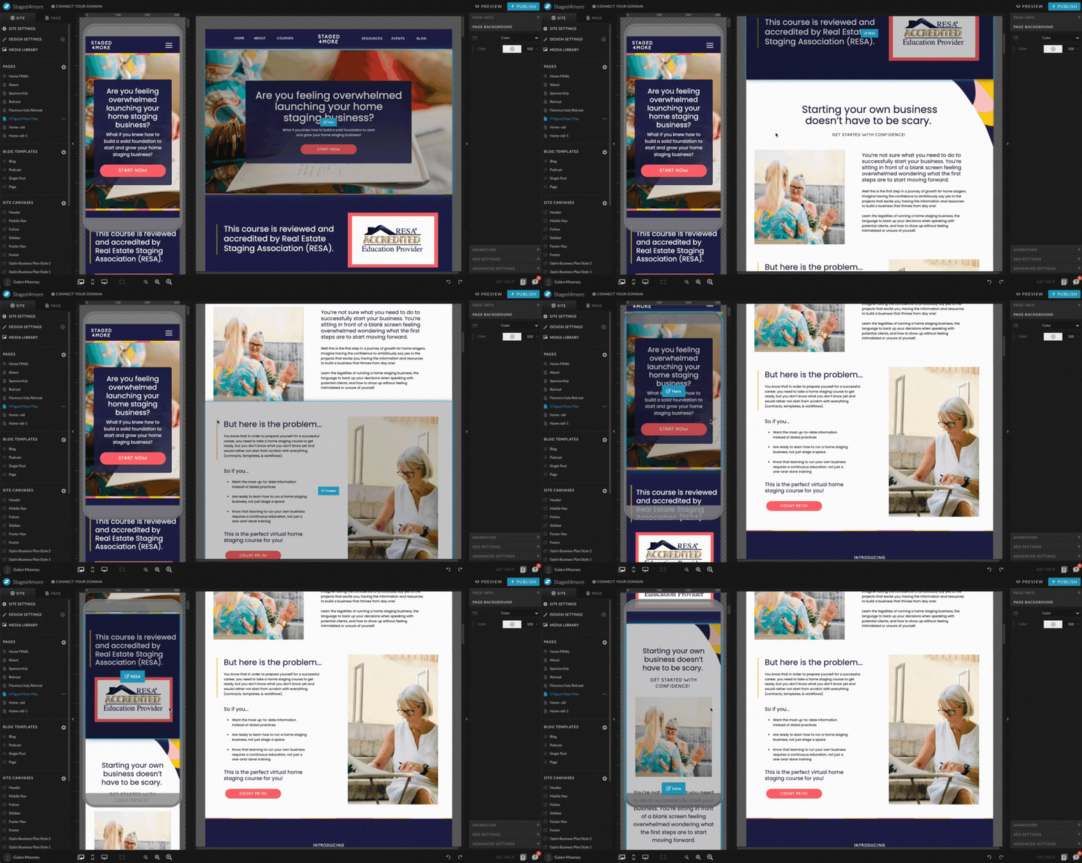
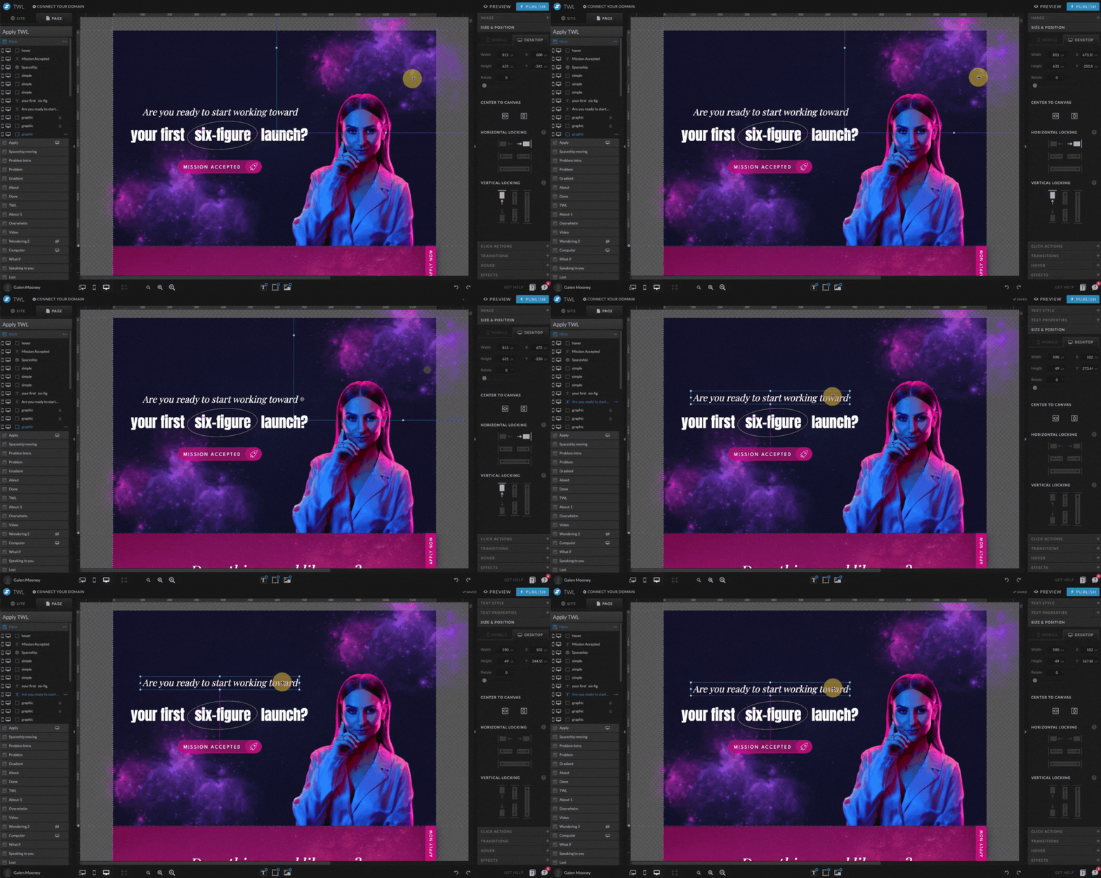
Showit has a super simple drag-and-drop interface that offers an insane amount of customization options. You can design a completely custom mobile experience which is critical as more traffic is coming from phones these days.

And when I say “drag-and-drop” I mean it. With Showit you aren’t tied to rigid grid systems like Squarespace or a clunky block editor with not-so-flexible templates.
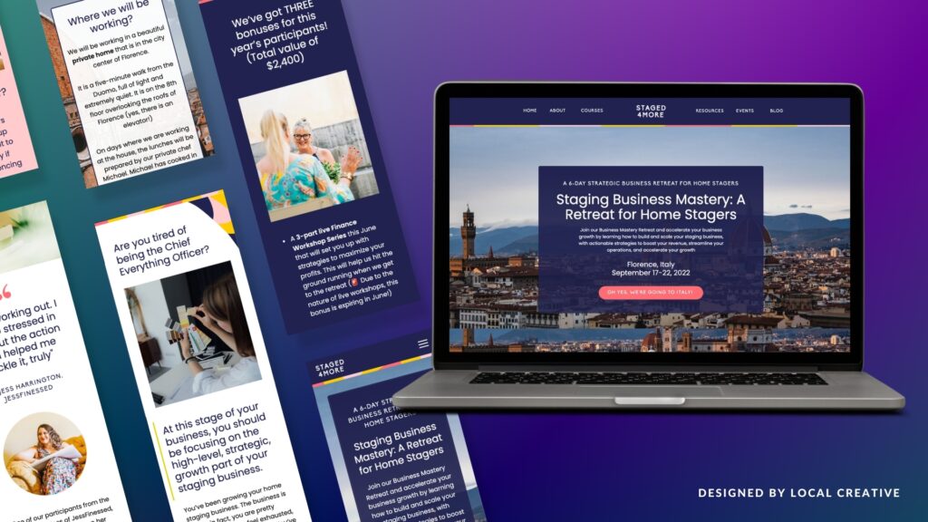
You can use Showit for your entire website, like I do, or use it as your sales/landing page builder. We offer Showit website and sales page design if you are looking for something completely custom.
What to look for in a sales page builder?
When evaluating sales page builders it’s important to consider the following…
Making changes to your sales page should be easy.
If you aren’t a professional designer or web developer, it’s important to use a sales page builder that you can edit on your own without having to hire someone every time you need a simple change.
Even if you work with a professional web designer (like myself) to build your sales page initially, you may want to make small tweaks to your copy, pricing, or other elements in the future and that can get expensive if you aren’t able to update things yourself.
While Showit can be tricky to setup initially if you are building out a long-form page like a sales page, once everything is setup, it’s a breeze to make changes.
I send all of my clients a personalized training video after every design project so they know how to swap images and change out copy or testimonials.
Even if they’ve never used Showit before, they feel confident using the platform in no time.

A unique sales page design is key to standing out
Sales pages tend to have A LOT of copy and you don’t want your visitors falling asleep on their keyboard because your design couldn’t keep up with their attention span.
Good sales page design means getting your message across clearly AND being visually interesting enough to get readers to keep scrolling.
Showit lets you add simple page animations, gifs, and videos to make your design stand out.
Copywriting is also key and a good sales page designer knows how to seamlessly integrate copy into the design so that it resonates with your ideal clients. Not sure where to start with sales page copy? We can help with that too. Just fill out the form here to get started.
How you integrate the checkout experience matters
Don’t make your potential customers “click” through hoops. Too many clicks means lost revenue so make sure your checkout experience integrates seamlessly into your sales page or is one click away.
You want to have plenty of call-to-action buttons throughout the page so you reduce the need to scroll endlessly. You can either embed the checkout directly on the sales page or have your CTA buttons seamlessly link to another page where users can checkout in a distraction-free setting.
CTA buttons should be a different color from the rest of your content so they stand out and draw in readers.
Showit lets you add embed codes anywhere on your website so there are very few limitations when it comes to which checkout platform you use.
Please note: Showit does not have built-in checkout or e-commerce functionality.

They do one thing: helping you design and launch a beautiful website, and they do it very well.
Personally, I see this as a plus because it lets me choose whatever checkout experience works best for me. I personally use and love ThriveCart because it’s completely customizable. I also like the fact that I only have to pay for the tool once instead of monthly or annually.
Sales pages should live on a custom domain
When you’re promoting your own course or digital product, you don’t want to be promoting your sales page builder at the same time. The experience should be completely branded and that starts with having a custom URL.
Potential clients shouldn’t be going to…
yourcoursename.salespagebuilder.com
You either want a custom domain for your program, or you can have your course live on a subdomain of your main branded website so something like…
yourcoursename.com
or yourcoursename.yourwebsite.com
or yourwebsite.com/yourcoursename
Are you looking for an all-in-one sales platform?
I personally have my entire website built on Showit, but if you are only looking for a sales page builder, you can keep your website hosted as-is and use Showit to launch your course or membership.
Having my website and sales page in one spot makes it so I have one less platform to pay for and as an online business owner, you know how quickly monthly subscriptions can add up.
While all-in-one platforms with sales page builders like Podia, Kajabi and Kartra seem like a great investment, I find many of my clients felt limited by the design options.
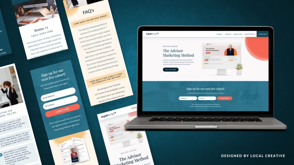
Sales pages start to all look the same when they are built using similar templates and blocks. Showit lets you go completely custom.

Check out this custom sales page we did for Alex Beadon here.
As I mentioned earlier, it’s important to know that Showit is NOT a shopping cart or e-commerce platform, but it integrates seamlessly with any third party tool that provides you with an embed code or a separate checkout page.
I personally use and prefer ThriveCart, because it’s a one-time payment vs. monthly but there are lots of great options out there.
Some people even use platforms like Podia for their marketing and checkout needs but still opt for Showit as their page builder because of its design capabilities.
Good customer support is always appreciated!
One of my favorite Showit features is the built-in chat support. There are real people in the chat ready to answer your questions and help you if you get stuck. I even met a few members of the Showit support team in person when I attended their conference in Arizona last year!
For those of you reading this that are less than tech savvy, this is a major benefit!
Working with a professional sales page designer.
Had you ever heard of Showit or considered using the platform to build your next course sales page? Let me know in the comments. I’d love to know!
While Showit is quickly becoming the platform I recommend most, the ability to customize almost everything on your new website or sales page can be overwhelming.
If you are new to Showit or website design in general, there is definitely a learning curve.
That’s why working with a professional designer who understands every step of an online business can be a great option!
From funnel design, to lead magnets, email marketing, webinars, evergreen deadlines, copywriting, and conversion optimization, we can help you come up with the perfect strategy for your business.
For custom sales page and website design click here and fill out the form.

Galen Mooney is the founder of Local Creative, a boutique web design studio crafting elevated websites for small business owners and creatives with a focus on connection, clarity, and growth. With over a decade of experience in design and SEO, she’s partnered with hundreds of creative brands to build custom Showit, Squarespace, and WordPress websites that build trust and momentum over time.