
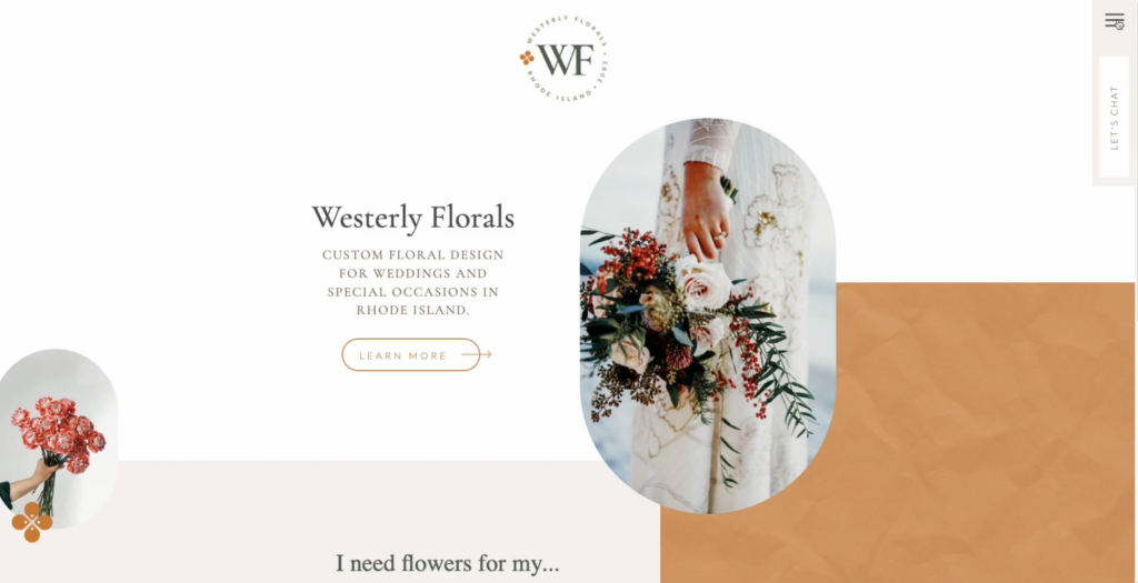
There’s a trendy style going around right now of having a mobile-style navigation (nav) on your desktop version of your website. I’ve even used this in a number of ways — both as primary and secondary nav. The coolest part is that the mobile-style nav will scroll with you or follow you down the page, making it easy to navigate your way around the website. Having your navigation bar show when you want it to (but hide when it’s no longer needed) keeps it from dominating the content on the page.
Want to learn how I do it?
Here I share with you how to easily add mobile-style navigation to your Showit website.
Transcription: How to Create Mobile-Style Navigation on Desktop in Showit
Right now in the web design world, there’s a trendy style going around of having a mobile nav on your desktop. I’ve used this in quite a number of ways. I’ve used it as the primary navigation for a website that I’m working on. And I’ve also used it as a secondary nav. So you’ve got your primary nav at the top, and then I’ve added a scrolling mobile style nav that follows you down the page, which makes it real. It really easy to navigate your way around the site without having to scroll back up to the top of a page.
I’m Galen from Local Creative Co. And in today’s video, I’m going to show you how to create this look and feel inside of the web design platform called ShowIt.
If we preview a page I’m working on here, you can see, as I scroll down the page, this little navigation over here is following me. And if I click on this navigation, there’s this nice animation that brings down the navigation, and then I can hide it again. When I no longer need it.
This also looks great on the mobile version of the site. It’s actually the same navigation here. It doesn’t follow you down the page because there’s not as much space on the mobile version of the site. So I don’t want that to take away from the content, but if I click these three lines, you’ll see that navigation pops up and then I can close it again afterwards.
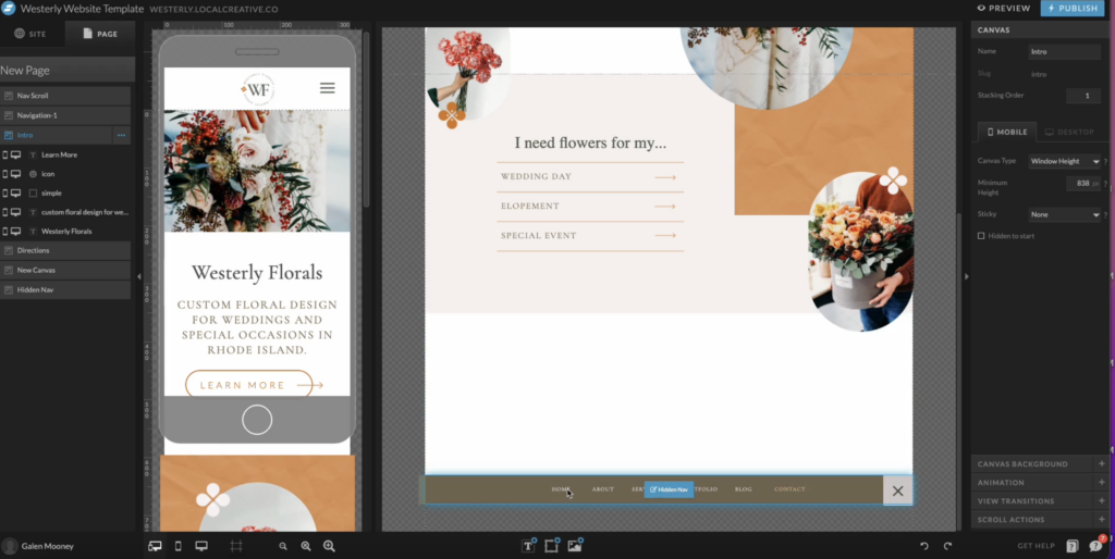
So, how do you actually create this in side of ShowIt, if you’re familiar with ShowIt, you know what ShowIt is made up of canvases? Every page has multiple canvases, including the navigation on your website.
This particular navigation, since it’s starting off as a hidden canvas, meaning it’s not visible when you first land on the site, it’s going to only be visible. Once somebody clicks the icon for the navigation, which is these three lines in the top right corner.
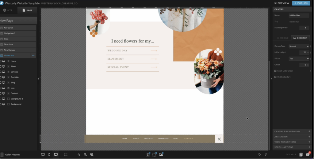
Because it’s a hidden canvas. I actually have it all the way at the bottom of the page here. And you can see here is the canvas at the bottom here on the left. If I scroll down, I can edit this canvas and you’d probably want to make this a site canvas, meaning you’re going to be using it in multiple locations around your site. And that also means that if you edit it in one place, it’s going to make those changes across the board, which will save you a lot of time later on.
I’m going to focus on the desktop view first, and I am going to hit command plus, or you can use this little zoom in icon down here and zoom in so I can see the nav. This is where I’m going to design the navigation. I’m going to add all the items that I need. I’m going to make sure that they’re aligned, that they’re linking to the proper spot. And then I am going to add an X in the corner here. So that way I can exit out of this nav and I’ll show you how I make sure this aligns perfectly later on.
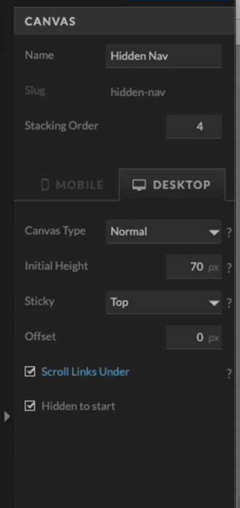
For the settings of this canvas, I am going to set the canvas type to normal, make sure that the height is set to the height that I want it to show at. And for the sticky options here, I want this to be sticky to the top of the page. I don’t need to offset it at all. And then I also want this to be hidden to start. So that way, when the page loads, this particular canvas does not show because we only want it to show when somebody clicks on the navigation icon.
For the canvas background, you could set this to a color of your choosing. In my case, I actually just used a rectangle to kind of cover this background. But if I wanted to, I could come in here, set this to a color, let’s choose that same kind of brown color. And then I actually want to set it to 95%.
And this is because it’s going to have a little bit of transparency to it, and you’re going to be able to see the tiniest bit of the site below. So the navigation, which I think gives it a really cool effect.
The next thing we’re going to do is add our X icon here, which is going to close the navigation. And I have already selected this. This is one of the default icons that comes with all ShowIt sites. I’m going to click on this X.
I am going to go to click actions here in the right menu, click add, and I want this to hide the canvas and I want it to hide this canvas, meaning that when I click this X, it is going to hide this hidden. Hidden nav canvas. So it’s hidden once again.
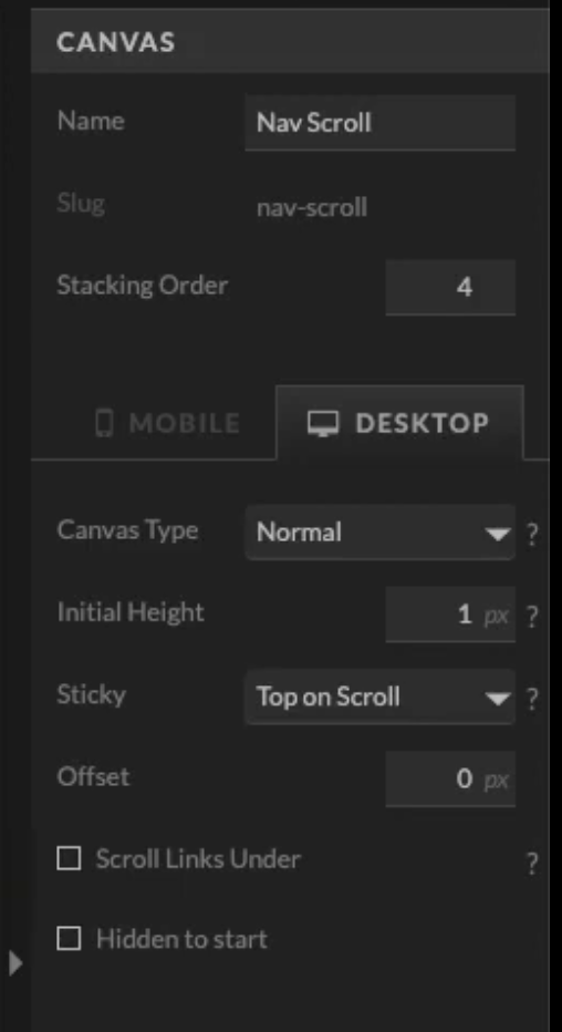
Now, if I scroll back to the top here, I have this other canvas called nav scroll, and this is this little, uh, scrolling navigation icon, as well as this call to action here. This is going to follow the visitor down the page to make it really easy for them to access the navigation wherever they are on the site.
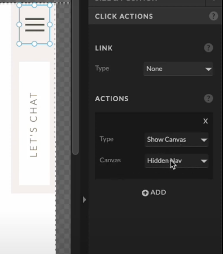
So for this, you can design it, however you like, just make sure that it has a navigation icon here. Again, this is from ShowIt’s default icons for this specific icon. We want to go to click actions and we want to set the click action so that it’s shows a canvas. And the canvas is going to show is that hidden nav canvas at the bottom of the page.
For this canvas, I have actually made this. So it is not visible on mobile. I have taken it off of all the mobile here. You can also just do that in the main canvas settings. I don’t want this to be visible on mobile because again, I don’t want that scrolling nav to follow people down the page on their mobile device.
You can really set this up in a number of ways. I’m just showing you how I have it set up here.
The other thing I want to do is come into the canvas settings here and just check to make sure everything looks good under the canvas settings for this specific canvas, because like I mentioned, it’s going to scroll down the page with you. It is a normal canvas. The initial height is only one pixel, which means that it is not going to take up any space on the page. It is actually going to overlap the other sections. That’s why I have the stacking order set to four here that makes sure that this particular canvas is going to sit on top of every other canvas on the page. I want to make sure that the sticky settings are set to top on scroll and then it looks like everything else looks good here. There’s no canvas background. I don’t have any animation or scroll actions. This all looks really good.
Now, because this scrolling canvas here is invisible on mobile. I want to make sure that people who are on the mobile version of this site can still access the mobile navigation. So I’m going to go over to the main navigation, or what’s called this, the logo header or something like that.
This logo, header section here. This has the logo for this brand. And if I scroll over to the mobile view, you can see that I’ve actually added an icon here as well. And I have clicked it off on desktop. So it’s only going to show up on mobile and this click action for this particular icon is again, to show the canvas and show the canvas hidden nav..
So this will also bring up the hidden nav. And if I click over to the hidden nav, you. You can see that I’ve already styled this for the mobile view.
You want to make sure that you’ve also checked off hidden to start for the mobile view of your site? Because remember inside of ShowIt, the desktop settings are different from the mobile settings. So you want to make sure that hidden to start is also checked and that it is set to be sticky. Uh, stick to the top on mobile.
For the canvas background here, I have set this to a hundred percent because I don’t want to see the site through the mobile nav. Otherwise you can kind of like see the site scrolling behind the mobile nav. So I kept this at a hundred percent. So that way there’s just no distractions.
And then I’m also going to double check here that this X is still set to type hide canvas. This all looks really good.
Okay. Just to recap here, we have our logo header canvas. This just has the logo for the site. And then it has the mobile nav icon, which is only visible on mobile. So I’ve, as you can see here, I’ve toggled it off on desktop. Then we have our nav scroll. This is the desktop nav that follows you down the page. And this is set to top on scroll and only one pixel, because we don’t want to actually taking up any space on the page. We want it laying over the existing content.
You can also link this little contact button here to go to your contact page or have any call to action that you’d like.
All the way down at the bottom of the page, we have the hidden nav. This is always hidden to start, and it is sticky to the top of the page. That’s why I can put it all the way down to the bottom here, because it doesn’t actually matter where it is on the page. Whenever somebody triggers this canvas to ShowIt is going to stick to the top.
This is hidden to start and everything else here is set to my liking. The one thing I didn’t mention. One is how did I get this background for this X to perfectly match up with the background for the scrolling navigation and I’ll show you what that looks like. So, as you can see, I just want to refresh here to make sure we have the latest version of the site. If I click this, you can see that that just drops right down.
And this stays exactly the same. I’ll show you how I did that to make sure this lines up perfectly. You could do the math and see the width of this, make sure it is set to the width of this same section here. And that it is the, this is basically like the sizing and positioning.
Right. I could check to make sure. Okay, this is 73. And the, um, the X coordinate or how far across the page it is, it is 1,128 pixels across.
So I can make sure that this is exactly the same, that this square here is exactly the same to make sure that’s going to overlay or an even easier trick is I can copy. I’m going to click on that box. I’m going to click copy.
I’m going to come down here to the bottom and let’s just pretend that’s not there. I’m going to paste it. And then as you can see it puts it exactly where it was in the other canvas. And then I’m just going to drag it to the bottom here to make sure the X shines through.
This is just a really quick way to line up objects from one canvas to another, and it creates a really smooth finished product.
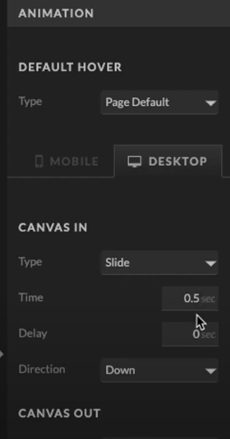
To get that unique animation where the navigation sort of drops down and then goes back up. I can come in here to the canvas navigation or the canvas settings for this hidden nav. I can come down to animation
And here I have custom canvas in and canvas out animation settings. I have set the canvas or the animation type to slide. I’ve set the duration of the animation and the direction to down so that it drops down when you click to open the navigation. And then when the canvas leaves, I have set the type to slide as well, but now it’s going to slide back up creating that really unique effect.
Let’s take a look again at how this works on desktop. And here it is on mobile. And you can see there’s the navigation and all of the links are working perfectly.
I hope you found this tutorial helpful. And I would love to hear if this has inspired you to try some cool things with your ShowIt website navigation.
Thanks so much for watching, make sure to subscribe. And I can’t wait to see you in the next video.
And if you’re new to Showit, click here to get an extended one-month free trial.
How to Create Mobile-Style Navigation
Ready to showcase your website content and minimize clunky navigation on your site? Here’s how to create mobile-style navigation in Showit.
Showit is made up of multiple canvases including the navigation on your website. With this particular navigation, since it’s starting off as a hidden canvas, meaning it’s not visible when you first land on the website, it’s going to only be visible once somebody clicks the icon for navigation or three lines in the top right corner.
Because it’s a hidden canvas, I have it at the bottom of the page.
Step 1: Make It a Site Canvas
If you plan on using this navigation in multiple locations on your site, it would be best to make it a site canvas. Note: This also means you only have to edit it in one place, saving you time in the long run.
Step 2: Focus on the Desktop Version
Hit Command + to zoom in to see the navigation at the bottom of the page and add items you need or edit the existing items you may already have on a template.
Make sure the items align in your navigation. Also, make sure items are linked to proper locations on your site.
Step 3: Select Your Settings
Go to Canvas in the right menu.
Select Canvas type ‘Normal’.
Set the Height to the height you want it to show at.
Set Sticky to ‘Top’.
No need to offset it at all.
Make sure both ‘Scroll Links Under’ and ‘Hidden to Start ’ are checked on.
For the canvas background, you could set this to a color of your choosing.
Step 4: Adding User-Friendly Exit Option “X” Icon
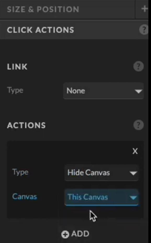
Click on ‘X’.
Go to click actions in the right menu.
Click ‘Add’.
Select ‘Hide the Canvas’.
You want to hide this canvas meaning that when you click on the ‘X’, it is going to hide this entire navigation.
Incorporating an ‘X’ icon allows users to exit the navigation panel with ease.
Step 5: Creating a Scrollable Desktop Navigation
Click on ‘Nav Icon”.
Go to Click Actions in the right menu.
Select ‘Show Canvas’ and ‘Hidden Nav’.
Design your Nav Icon, however you would like but make sure to grab the Navigation icon from one of Showit’s default icons.
De-select ‘Visible on Mobile’ from the settings so that on mobile it does not follow them as they scroll down the page.
Step 6: Refining and Animation
Go to Canvas settings for the ‘Hidden Nav’.
Select ‘Animation’ in the right menu.
Select settings for Canvas In and Canvas Out.
For Canvas In select Direction to be ‘Down’ and for Canvas Out select Direction to be ‘Up’.
Double-check how the Nav Bar looks on the Desktop and Mobile view.
Empowering Your ShowIt Website
Implementing a mobile-style navigation system on Showit empowers your website with enhanced accessibility and a modern touch. By seamlessly integrating these elements, you can elevate user experience across both desktop and mobile devices.
New to Showit? You can get an extended free trial on me! Click here to get started.
I hope this tutorial inspires you to explore innovative navigation techniques for your Showit website. If you found this helpful, check out this other blog post here on some web design shortcuts inside Showit or why Showit over Squarespace for more insightful content. Feel free to share your experiences or ask any questions in the comments below!

Galen Mooney is the founder of Local Creative, a boutique web design studio crafting elevated websites for small business owners and creatives with a focus on connection, clarity, and growth. With over a decade of experience in design and SEO, she’s partnered with hundreds of creative brands to build custom Showit, Squarespace, and WordPress websites that build trust and momentum over time.
