Fonts can make or break a website. So, how do you find unique, premium fonts for your web design business? Here are some of my favorite resources and a few font trends I’m loving right now.
Best Premium Fonts for Web Designers
Are you ready to nerd out over awesome fonts with me? I’m Galen and I’m a web designer and I love fonts so much. I made a three-part YouTube series all about them. I’ll include the links in the description below. If you want to check out the other two videos.
In this video specifically, I’m going to be talking about the best premium fonts, in my opinion, for web designers and also some free and paid font websites you can use to get inspired for your next design project. Before we dive in to some of the font trends I’m seeing right now, and a bunch of bite favorite fonts that you can use yourself. I want to talk about some best practices with fonts and how I use them on my web design projects. Whenever I’m designing a website for a client. I like to think about the three main fonts that we’re going to be using. I don’t like to go over three fonts. Cause then I think the site starts to feel a little bit cluttered, but two or three fonts is just right.
Typically there’s one main font that I’m using for the headings on a website, one main font for the body paragraphs and then either an accent font that could be a script or something, a little bit more fun, or a unique font for certain subheadings
I personally really love pairing fonts that have a little bit of contrast to them. So maybe a Serif font and a San Serif font. Or a chunky, bold font mixed with a thinner font. I think it’s really fun to mix those up and I love how they look when they are next to each other. They’re not competing with one another.
They look unique and they come together to create a really nice finished look. It’s important to keep in mind that the fonts you use on your website can really change someone’s experience while they’re scrolling around your site. So for example, if your brand is a little more playful, incorporate some more playful fonts to kind of keep that vibe. If your brand is more serious, maybe pick a more serious type face, like a standard Serif.
The other thing that I want you to keep in mind is that you need to make sure you’re purchasing the correct license or that you have access to the correct license for the font that you want to use, depending on how you’re going to use it. Just because you found a free font online doesn’t necessarily mean you can use it on your website project.
You need to double-check. Is that. Free for commercial use. Is it free for personal use? Because if you’re a small business, you can’t be using fonts that are only available for personal use.
Google fonts, for example, is a wonderful resource of free fonts that are free for both commercial and personal use. So you can use them on any of your website or branding projects. But other online font marketplaces that you have are going to have a different licenses. So you need to read the fine print to make sure that you’re purchasing the right kind of license, depending on how that font is going to be used.
A font that you’re going to use in your logo or on print materials for your business is going to require a different license than a font that you’re going to be using on your website.
If you really want to stick with free fonts on your website, I can’t recommend Google fonts enough, but there’s a really cool website you can use to help you decide which Google fonts are going to be the best fit for your project.
This particular site is called font joy.com and it randomly generates different Google fonts so that you can see how they look together and pick fonts that are going to pair really nicely.
All you have to do is hit this generate button here. And it’s going to come up with a new set of fonts. And if you like one, but you want to keep cycling through the others, you just hit that little lock icon, come back to generate that first font that you chose is going to stay there.
And the other two will keep cycling through until you find a font that you like for your website.
Don’t get me wrong. Like I said, I love Google fonts, but sometimes you want something that’s a little bit more interesting or maybe even on trend for your business or industry.
Two of my favorite resources are creative market.com and Etsy because they have a ton of really unique and interesting fonts that you can use in a variety of places in your business.
Keep in mind when you’re searching these larger font marketplaces that these fonts are often created by a small business owners. And a lot of them have their own websites that you can purchase from directly.
When you purchase through a creator directly, the marketplaces can’t take a cut of the profit. So the prices actually tend to be lower and it’s a win-win for everyone.
Now let’s dive in to some font trends that I’ve been seeing lately, and I’ll share some examples of each so that hopefully you’ll get some inspiration for your own designs. The first trend that I’ve been seeing is kind of that vintage retro font. Look, this could be taken really far to the extreme, where we’re talking about hardcore, retro. Where it could be something that’s a little bit more subtle.
This is an example here called Kilimanjaro Sans. I thought this kind of had a cool texture to it.
In the example with how they used it. It is a Sans Serif font, meaning that it doesn’t have any of those little tails on the end of the letters. I loved this one as well. It feels very much so like a magazine style font, a lot of fun. And they’ve obviously layered over some of that noise to kind of give it that vintage feel.
There’s another example here. This is a little bit more obvious retro, but I liked this example as well. And I think it’s just sort of playful and fun and could work for a brand that has a little more of that fun personality type.
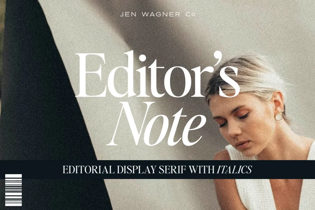
This font editor’s note by Jen Wagner co I love her fonts is an absolutely beautiful font, very classic, very chic, but still has a little bit of those vintage vibes.
The next font trend I’m seeing are really thin classic minimalist fonts. These could be Serif or San Serif. And here’s an example here. This one is called montage and I love how simple and clean this is. As I scroll through the example, imagery here. There’s a couple more examples. This one is called Hannah again, very clean and simple.
This one is a little bit more playful and it looks great in capitals or an all uppercase or lowercase letters. I love that. That almost has a little bit of a retro vibe too. Then we’ve got this one called posture, very clean, very minimalist. I love the mixture of those thick and thin lines. I think that looks really good here and kind of adds to that thin lined look.
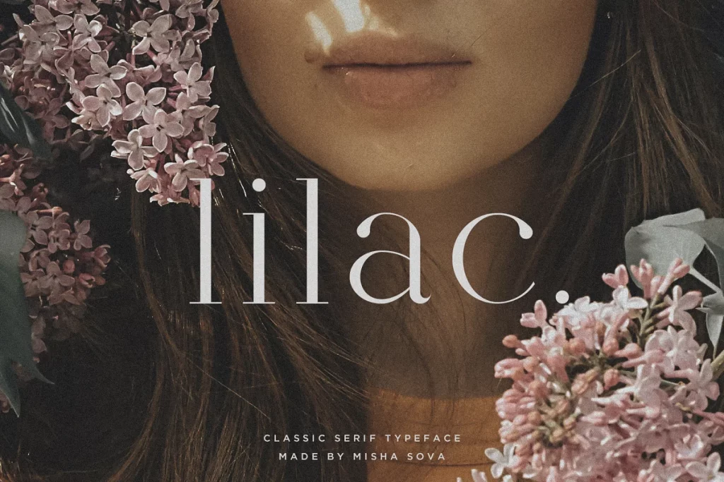
One more, very similar. This one’s called lilac. It’s basically the Serif version of some of these other fonts. Again, I like the thin lines. I like the fluctuation between the thick and the thin lines with this type face. And it just has this super elegant look.
Next, I’m seeing a lot of soft kind of rounder, chunky fonts. If you will, these are a little more playful. They have rounded edges. They feel very much. I had a couple examples of this one, too. This one is called milk and clay. It almost has like a handwritten texture to it. I loved the look of this font. I think it looks great by itself.
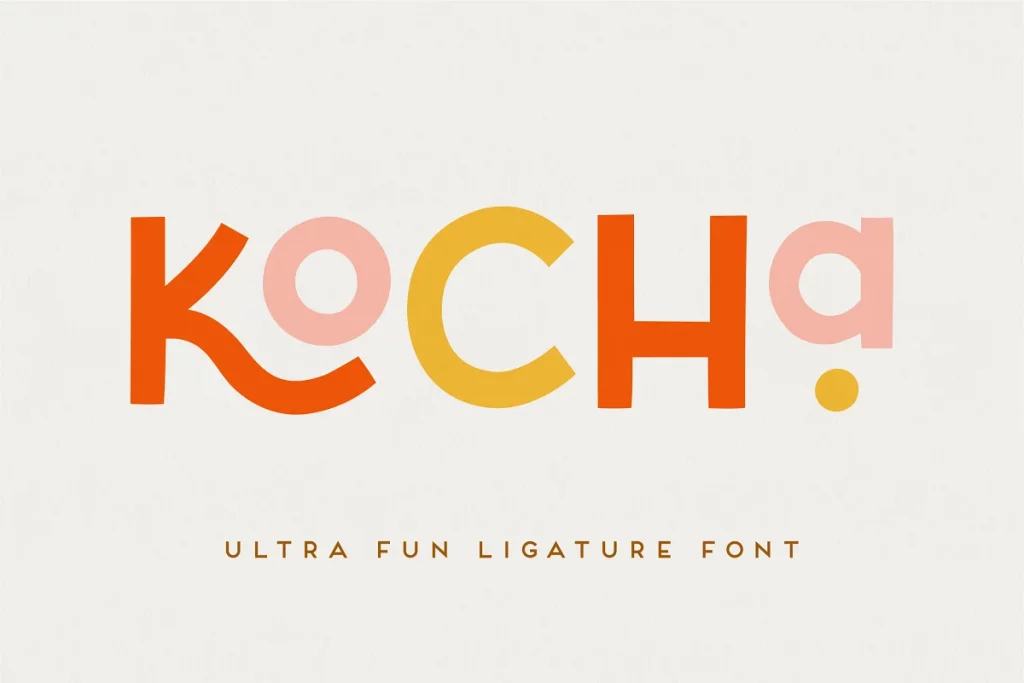
It looks great as used as part of a logo. And it’s just all around a really. Simple clean font face. This next one is a little bit more playful and it has some interesting characters. We’ll talk about that in a second too, but again, kind of a fun, chunky font, and they’ve used a lot of bright colors here to show off the characteristics of the font and to show off that playful nature.
It also looks like this font comes in a clean as well as a rough style, which is interesting. You can see from the example photo here, some of the edges in the rough one are a little rough, as you can imagine. And it gives it again that more kind of like earthy, natural playful texture to it.
One thing I love about creative market is you can test out all of the fonts with your own text. So you’re able to put it in your own headings. I tend to like to put in the logo name to test it out or the brand name to test it out. I might put in some sample headings that you might have as like a blog post header, or might be some paragraph text, just to see how the font looks with all the different characters.
You also want to keep in mind that for a heading font, you could have a little bit more fun. You can go a little bit wackier with the different letter shapes and things like that because it’s going to be used more sparingly and it’s going to be larger and easier to read. But your paragraph texts, the primary goal should be that that text is super easy to read.
You don’t want your website visitors. You don’t want their eyes to get tired as they’re scrolling through your website. So you want to make sure that your paragraph texts in particular is very easy to read and you want to have it at a size that makes it easy to scan.
The next trend that I’m seeing is handwritten script fonts that actually look like handwriting gone are the days of the really swirly calligraphy scripts. Those are still cool. Like I think they still can stick around and still have a place. But in general, right now, the trend I’m seeing is much more around.
Fonts that actually look like your handwriting. And sometimes for clients all even ask them to show me samples of their handwriting, if they like their handwriting and try to find a font that matches as close as possible to that, just to give their website that authentic handwritten vibe for script fonts.
I am always using them as accent font, so I don’t want to overdo it with script fonts because they tend to be harder to read, but they make great accent fonts used sparingly throughout any website.
. This specific example is a beautiful handwritten font and you can see it even has some variations in the thickness and it looks like it was actually written in ink. We’re going to see some other examples here. This is another handwritten font, very different from the previous one, but it still has kind of that handwritten vibe it’s still looks like maybe it was written with a Sharpie or a thicker pen, but it has that script look of almost like the same type of scripts that you learned to write in middle school.
Which I think is really fun and a playful idea or a playful take on a handwritten script. You can see how the two versions of this font are sort of used together the script with the all uppercase font. And I love that these look like beautiful Instagram posts right out of the box.
Here’s another example.
Again, this is an all uppercase font here. Oh, it looks like it actually has an uppercase and lowercase. You can see the samples down here and it comes with these fun little font characters that you can add on. But I love seeing the examples that this font is using again. I think they just shows you that the font by itself would make beautiful social media at content.
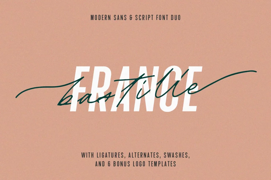
Here’s one more example of an elegant script font. This is actually a font duo. I love finding font duos that are available because then you see the fonts together. You see how they pair together before you actually buy them. This is a really beautiful script font, and it looks just like my scribbles, but again, This is a little harder to read.
So you either want to use it larger so that you make sure that people visiting your site can read it easily and use it sparingly. So you don’t overdo this font or use it for texts. That’s less important for texts. It doesn’t necessarily need it to be read and consumed 100%.
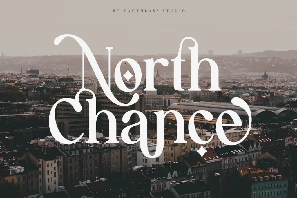
The next font trend that I’m seeing a ton of lately are fonts with unique characters. This is one example. This one is called Aurora, and you can see it’s got that sideways. Oh, which I think is really cool. Here’s an example with an alternative a where the, a, the line from the a is kind of curved upwards rather than going straight across.
These are really fun and very popular right now. And the nice thing is. You can do your own take on this. There’s so many fonts with unique characters, you can pick one that works for you and your brand. And I’ve got some fun examples here. This one is called Tokyo dreams, and you can see how it’s got big letters and small letters and special characters where like the R here comes in curves under the O or this special T.
These are really fun to use as headings or logo fonts on your website.
This is another popular one right now. I’ve been seeing this a lot of places it’s called Mon Cheri. And it also has some interesting characters and some different size letters in some connected literature, some ligatures it’s just got some really interesting characteristics and some things that really set it apart.
So when someone lands on your website, they’re going to be like, wow, that’s a really cool, unique typeface.
Here’s one more example of a thicker Serif font that has some really unique characters that has some connected characters and would make a really fun heading font. You can also see this one has a little bit of that retro vibe as well. A lot of these fonts I used as inspiration actually fit into more than one font trend.
Now I’d love to hear from you out of all of these font trends, which one is your favorite? Which one are you most excited about? And which one do you hope goes away sooner rather than later?
Let me know in the comments below, and don’t forget to subscribe. So you don’t miss any videos we put out in the future. And if you loved any of these fonts, I’m going to link them in the description below so you can check them out for yourself.
Thanks so much for watching and I’ll see you in the next video.
Where to Find Premium Fonts for Web Design
My favorite resource for finding unique, premium fonts are Creative Market and Etsy. I use these platforms to research fonts I love, and then I visit the independent creators’ websites to purchase directly from them. That way, the creator doesn’t have to share a portion of the sale with the marketplace platform. Not only does this help the creator out, but it can also save you a few bucks!
If you’re looking for free fonts, try FontJoy! This program automatically generates combinations of free Google fonts. You can cycle through different fonts to find a combination that fits your brand, and then you can download all of them for free.
Best Practices When Using Fonts in Web Design
There’s nothing I hate more than landing on a beautiful website with a totally illegible font. Before you start designing, consider these best practices:
- Use 2-3 fonts per website. I usually choose a headline font, a paragraph font, and a third, more interesting font as an accent.
- Pair contrasting fonts. A chunky, bold headline paired with a simple, thin paragraph font makes for a more visually appealing and easy-to-navigate site.
- Choose fonts that reflect your brand. If your brand is serious and simple, go with a more serious font. But if your brand is more playful, get funky with it!
- Purchase the correct license. For web design, you’ll need to purchase a web font license. Just be sure to read the fine print, as some designers charge more for sites with more traffic.
My Favorite Premium Fonts for Web Designers
Font trends come and go, but these are the ones I’m loving right now.
Vintage & Retro Fonts
These fonts are bubbly, classic, and tons of fun. Depending on the colors you pair them with, you can go all-out retro or keep things a bit more refined.
- Kilimanjaro by Nicki Laatz
- Eighties Comeback Serif by Nicki Laatz
- Regards by Sensatype
- Editor’s Note by Jen Wagner
Classic & Minimalist Fonts
These fonts feature simple shapes and thin lines for a modern but classic look. Pair them with a swirly script and you’ve got a winning look for a refined business.
Playful & “Chunky” Fonts
I love using playful, “chunky” fonts for headlines and logos. Not only are they eye-catching, but they can also add a ton of personality to your brand!
Realistic Handwritten Script Fonts
Gone are the days of super swirly script fonts. The current trends skew more towards these realistic handwritten fonts. If you really want a brand that feels personal, choose one that’s similar to your own handwriting.
- The Impressionist by PeachCreme
- Palmer Lake by Jen Wagner
- Just Saying by Nicky Laatz
- Bastille Font Duo by Jen Wagner
Fonts With Unique Characters
You can do so much with a unique, well-designed font. These feature interesting characters that can add even more personality and spunk to your designs.
Want to attract your dream clients and scale your web design business?
Check out these posts next…
- How to Build Your Web Design Portfolio From Scratch (With Zero Clients and Experience)
- How to Make Passive Income As a Web Designer
- How Content Marketing Can Lead To Consistent Clients With Paige Brunton
- How to Confidently Crush Sales Calls As An Introverted Creative

Galen Mooney is the founder of Local Creative, a boutique web design studio crafting elevated websites for small business owners and creatives with a focus on connection, clarity, and growth. With over a decade of experience in design and SEO, she’s partnered with hundreds of creative brands to build custom Showit, Squarespace, and WordPress websites that build trust and momentum over time.