
I’ve been developing websites for years now, and I know the power of a great homepage. A strong homepage – one with good SEO, a clean layout, and engaging content – means more site visitors, more inquiries, and more clients. What’s not to love?
Squarespace, my site builder of choice, makes it easy to optimize your homepage. Here’s how to create strong SEO on your Squarespace homepage and get your site one step closer to the first page of Google.
If you’re ready to get started with Squarespace now, click here to save 10% off your first subscription of a website by using the code PARTNER10.
Why You Need to Optimize Your Homepage in Squarespace
Not only is your homepage the most-visited page on your website, but it’s also your potential clients’ first impression of your brand. A strong homepage gives them a clear understanding of who you are, what you offer, and why they should work with you.
Your homepage is also your site visitors’ roadmap. It should guide them to their next step, whether that’s reading your blog, booking a call, or purchasing a product. A great homepage funnels your visitors in the right direction and one step closer to working with you.
Optimize your Squarespace homepage with these simple tips.
How To Optimize Your Homepage in Squarespace
VIDEO TRANSCRIPTION: Squarespace Homepage SEO
Hey everyone. I’m Galen from Local Creative Co. And in this video, we’re going to be talking about how to optimize your homepage for better SEO. Now I’m a website designer and I have designed a lot of Squarespace websites. I actually used to be a WordPress developer, but I switched over to Squarespace years ago and I’ve never looked back.
I have a lot of opinions about how your Squarespace homepage should look and feel. And what it should do, what should be the function of that homepage? What are we trying to get your ideal clients to do once they land on your website? Your homepage is really important because it’s probably one of your most visited pages on your website.
It’s the first impression people have of your business and your brand. The first mistake I see people making all the time with their homepage is they’re missing their three W statement, as I like to call it. And what that is, it’s the who you are, the what you do, and the where you do it statement. And it tells people they’re in the right place from the second they’ve landed on your website.
Now I can’t tell you how many times I’ve landed on a small business website and I have no idea where that business is located. And because I’m usually short on time and I have a short attention span, just like pretty much everyone else I know, I will usually hit that back button before I take the time to scroll through their website to find out where that business is from. What that means for you as a business owner is you want to make the who, the what, and the where of your business, crystal clear to your ideal clients and front and center on your website. You also need to make sure that your website is easy to read. That means no crazy fonts that I can’t understand and no super teeny texts that makes me go get a magnifying glass.
Another mistake I see all the time is really short homepages without any actual content on it. Not only are you wasting this valuable real estate on your website, but you’re not doing yourself any favors when it comes to SEO because Google needs to have text content on your site to understand where to place your site in search rankings.
I prefer to see longer form homepages, kind of like a table of contents. I want a brief introduction to your site. Who’s the person behind the business, the services that you offer and where I can go to find more information. Whenever I mention adding more text to a homepage, people always shy away from that and they’re saying my audience is more visual. They don’t really want to read all that text. And that’s why it’s important that you format the text. In a way that’s really visually appealing. And that means mixing in headers and paragraphs and images so that everything looks really cohesive when it’s put all together. Always remember to add call to actions to your homepage, and that could be a link or a button that takes them somewhere else on your site. Whether that’s your portfolio or your contact page, you always want to be leading people to the next step.
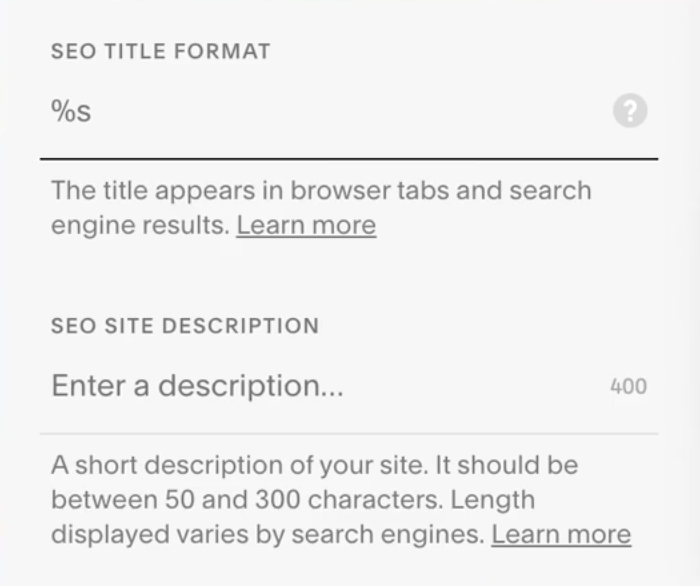
While the content on your homepage is really important for guiding people through your site and helping your website rank higher in search engines. You also want to pay attention to the SEO settings behind the scenes. In Squarespace you’re going to go under marketing and then SEO to adjust your settings.
You’re going to want to pay attention to your site title and description, which should include the three W’s I mentioned earlier. As always, if you enjoy this video, make sure to let me know in the comments. Say hi. Tell me your biggest takeaway. I’d love to connect with you. Thanks so much for watching and I’ll see you next time.
Looking for help with SEO? Did you know you can hop on a call with me to get my eyes on your website with a one hour collaborative consultation. Together we’ll work on your website one-on-one and come up with a strategy you can use moving forward. Book your SEO Power Hour here.
Include Your “3 W’s” Statement
Your “3 W’s” – who you are, what you offer, and where you offer it – should be front and center on your homepage. Truth is, we all have short attention spans. If a visitor lands on your site and can’t immediately figure out your 3 W’s, they’re most likely going to hit the ‘back’ arrow.
When writing your 3 W’s, consider…
- Who you are as a business owner. Introduce yourself and your brand to your ideal clients, and explain what makes you unique.
- What you do, and why it’s special. Anyone landing on your site should know right away what you have to offer and how they can get their hands on it. If that information isn’t easy to find, they’ll bounce.
- Where you are located. The last thing you want is a new inquiry from a potential client outside of your service area. If your work is location-specific, make your location glaringly obvious on your homepage. If you work remotely, mention that, too!
If you can fit all this information above the fold on your homepage (meaning visitors won’t have to scroll to find it), all the better!
Make it Easy to Read
A beautiful layout is great and all, but your homepage won’t perform well if it’s difficult to read. Avoid tiny text, intricate fonts, and busy patterns. Instead, focus on making your homepage user friendly and easy to navigate.
Also, make sure the content itself is easy to understand. Think about your ideal client, how they speak, and what they know. If your content is full of industry jargon, it might be difficult for your site visitors to comprehend. Skip the fancy lingo. Keep it simple.
Use Plenty of Text
My clients constantly tell me, “My audience is really visual, so I don’t want to use a lot of text on my homepage.” But no matter what you offer – photography, design, or a product – your homepage needs plenty of text. This content helps Google determine where to place your site in search results. If you don’t have enough text, you won’t show up in Google. Simple as that.
I’m a huge proponent of the long-form homepage. I like including tons of text and plenty of space to scroll. Your potential clients should be able to learn nearly everything they need to know about your business from your homepage.
Still, you don’t want to bog your site visitors down with huge paragraphs. Use headers, images, graphics, and bulleted lists to keep your homepage visually appealing and easy to understand.
Include Calls to Action
The purpose of your homepage is to guide visitors to the next step, be that booking a call with you, sending you a message, or purchasing your product. Whatever your preferred call to action is, make sure to feature it on your homepage. Create a button to make your CTA more eye-catching, and add hyperlinks into your text.
Adjust your SEO Settings
Don’t forget to check your settings behind-the-scenes! These are easy to overlook, but they play a huge part in getting your site onto Google.
On your Squarespace dashboard navigate to the MARKETING tab. Then, click SEO.
Under your SEO settings, you can create a title and meta description. This is the blurb that shows up on Google’s search results. Write a short blurb about your site, being sure to include your 3 W’s from earlier. This will make your site more appealing in Google search results and inspire more users to click.
Squarespace SEO for Creative Entrepreneurs
You don’t have to be an SEO genius to get your site onto Google. Join The Creator Club, my membership for creative entrepreneurs, for more resources and tips on creating an unforgettable Squarespace website.

Galen Mooney is the founder of Local Creative, a boutique web design studio crafting elevated websites for small business owners and creatives with a focus on connection, clarity, and growth. With over a decade of experience in design and SEO, she’s partnered with hundreds of creative brands to build custom Showit, Squarespace, and WordPress websites that build trust and momentum over time.
