I’ll be the first to admit that I didn’t love Squarespace 7.1 when I first tried it. I didn’t know where everything was and I couldn’t easily make my usual edits. But after building a few websites on the platform, I can happily say I’m back to my quick workflow and so glad I made the switch.
If you’re hesitant to make the switch to Squarespace 7.1, you’re in luck! I’ve created a total breakdown of everything Squarespace added (and took away) so you can make an informed decision before migrating your site.
And if you’re new to Squarespace, get 10% off on Squarespace Using this Link and Code “PARTNER10” at checkout.
Want more videos like this one? Click here to subscribe on YouTube.
VIDEO TRANSCRIPTION: Squarespace 7 vs. Squarespace 7.1 and Should You Switch?
Today, we’re going to be talking about one of the questions I get asked all the time. What’s the difference between Squarespace 7 and 7.1? And should you make the switch?
Now, I’m not gonna lie. When Squarespace first came out with 7.1 and I tried the platform I absolutely hated it. I started building a site and realized, I didn’t know where anything was. I wasn’t sure how to make all of the changes that I was so very used to, but eventually I got over it.
I built a couple of sites and now I am in love with a lot of the changes that they’ve made with the new platform.
By no means is Squarespace 7.1 perfect. I’ll talk about some of the cons later on in this video, but they did add so many, much needed features that Squarespace 7.0 is simply lacking.
One of my favorite things about the new version is that all of the templates have the exact same features and functionality. You no longer have to ask; am I part of the Brine template family and my part of a different template family? Does my template have these features? Can my template look like this?
Because the answer is always, yes on 7.1. All of the sites, all of the templates have the exact same functionality, and you could build the same exact site on each one. You’re just choosing a base style to get started with.
The next big change I want to mention is with the design settings.
If you’re used to Squarespace 7.0, this might make you want to pull your hair out, but it’s really worth getting used to because it’s going to speed up your workflows.
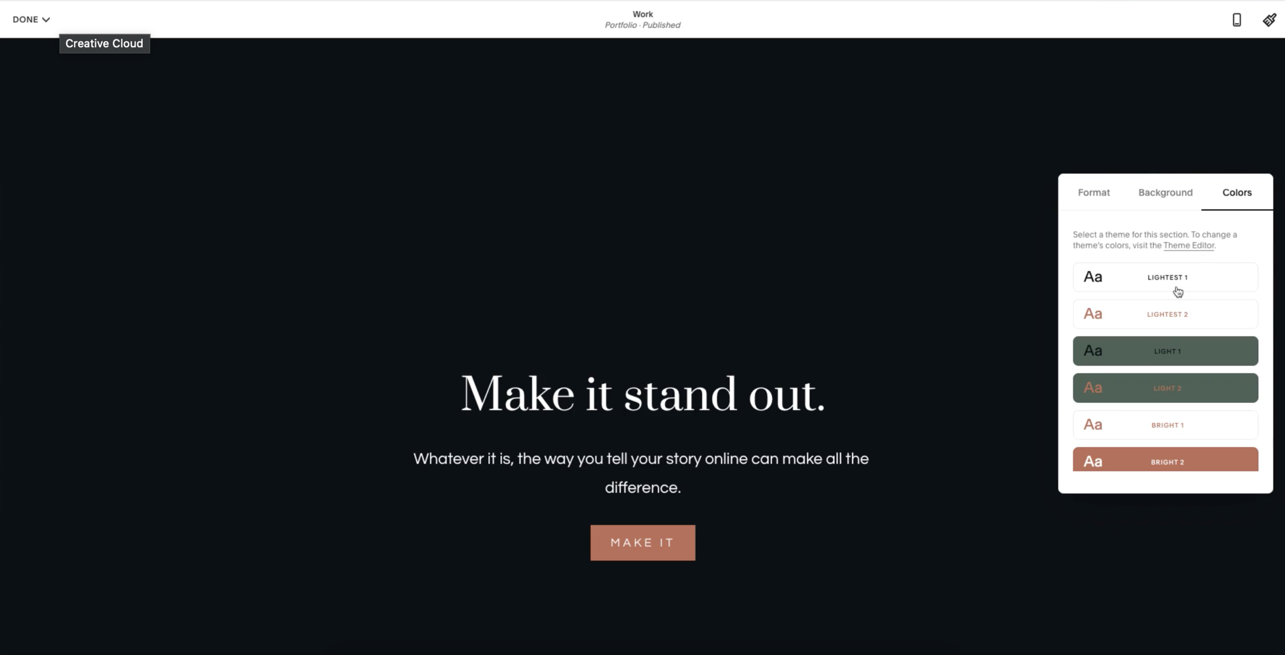
You can now create a custom color palette for your website and that way you set all the colors upfront. You can always customize them later, but it’s really nice to have a base color palette to work from as you’re designing the rest of your site. If you are a fan of the Brine template family on Squarespace 7.0, you’re most likely familiar with creating index pages with multiple page sections. The most frustrating part about that was that you couldn’t easily change the background in text colors from one section to the next, without knowing custom CSS.
Every single page on Squarespace 7.1, not just index pages every page has the ability to have multiple sections that can be customized independently. Each section could have its own section theme, and you can customize those in your design settings.
If you want one page section to have a dark background in light text, you can do that. If you want one to have light background and dark texts, you can do that as well. You can also still add a videos and images as backgrounds to these individual sections.
In my opinion, this was the best feature they added with Squarespace 7.1, because I’m creating a lot of longer form pages. And I was using index pages to do this. Every time I wanted to duplicate an index page, I actually had to duplicate every sub page within that index and then redo all the custom CSS to get the same styling.
Now everything is built into one page. You can change the colors really easily and you can duplicate it with one click.
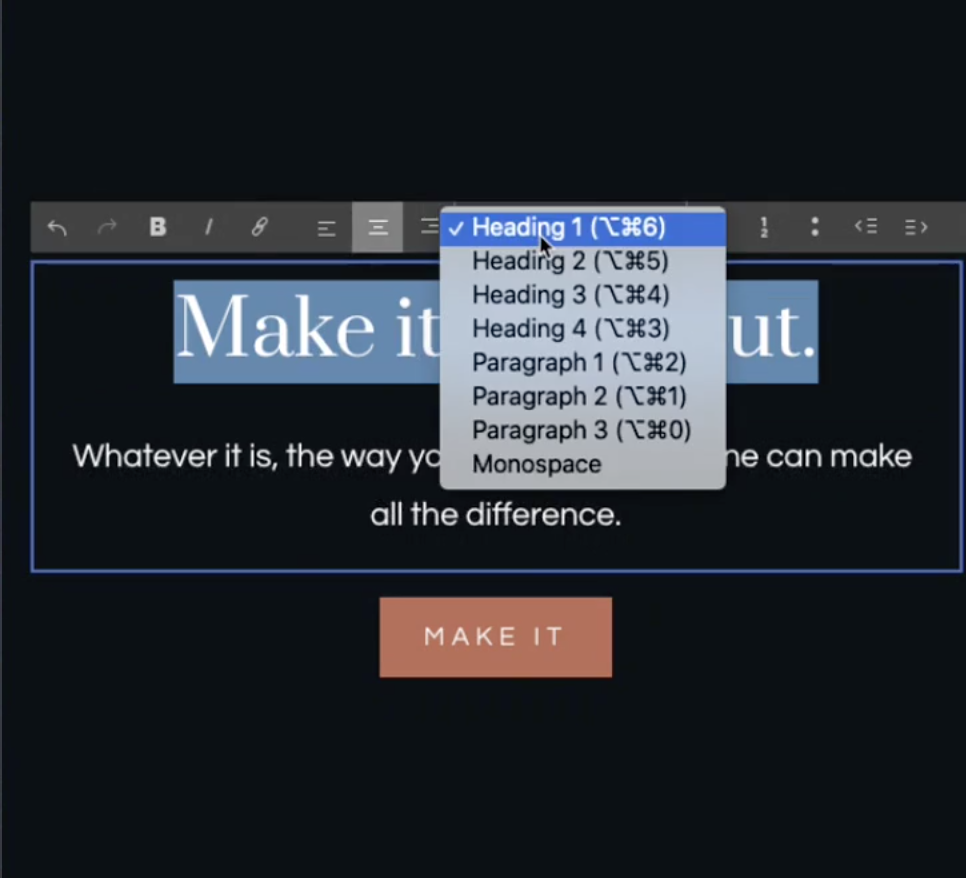
Another thing they added is an additional heading style and three new paragraph styles. So you can have a heading one, two, three, and four, as well as paragraph one, two and three, which can all have different sizes.
The bad news is if you want to change the font style for one of your headings, you have to do that with a little bit of custom CSS, but it’s pretty easy to set up.
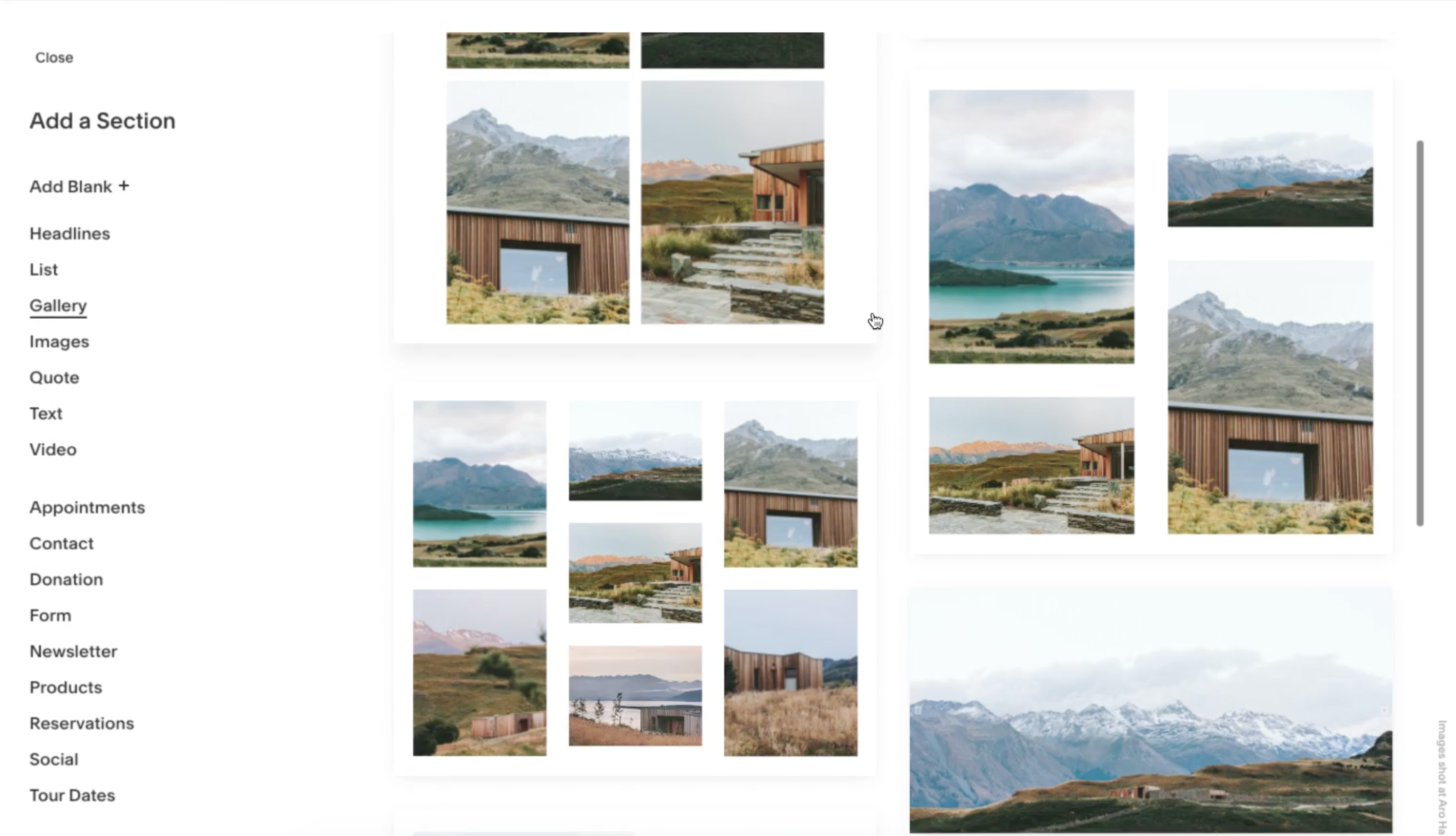
One of the things they got rid of in Squarespace 7.1 is gallery blocks. I know a lot of you are probably familiar with gallery blocks and you relied on them quite heavily. They’ve now been replaced with gallery section. So instead of adding a block to a page, you now add an entire section for your galleries, which can be seen as a pro or con depending on how you look at it.
I personally miss a little bit of the flexibility with gallery blocks, but I’ve been able to make do with the new gallery sections.
In 7.1, they standardized the blog layout. So, you have a few different options to choose from, but none of them have a sidebar. You can still hack it together or use a little bit of third-party code to make it work for you. But there’s nothing out of the box.
So, keep that in mind. If you’re looking to switch.
All in all, the sites I built on 7.1 are mobile friendly, load quickly, and were really fun to work on.
I personally have no regrets about making the switch to 7.1 and I highly recommend the platform, but there’s a few things I want you to think about first.
Before you go looking for that magic button, that’s going to upgrade your site. You should know it doesn’t exist.
If you want your site on Squarespace 7.1, you actually have to start from scratch and take your existing site and copy and images and move those over to the new platform.
I actually offer Squarespace migrations as a service to help people make the switch, because it is such a daunting process, but there are some third-party tools out there that you can use to do it yourself.
You want to be sure that when you’re moving your domain from Squarespace 7.0 to your new 7.1 website, that you’re not breaking any links, cause that could have really damage your SEO and your website’s relationship with Google.
If you have any questions about making the switch, I have a blog post all about it, or you can reach out to me and my team to get the process started.
Make sure to like and subscribe if you learned something in this video and let me know in the comments, if you’re going to be making the switch to 7.1, or if you’re going to stay where you are and stick with 7.0. Thanks for watching and I’ll see you in the next one.
What’s New in Squarespace 7.1?
Universal functionality across templates.
This is perhaps the best upgrade Squarespace made with 7.1. Now, every template has the same features and functionality. You no longer have to worry about staying in a certain template family or missing out on any cool features. The template is the starting point, but you can technically create the same website with any of them.
Updated design settings.
At first, this update made me want to pull my hair out. But now, it’s made my workflow so much quicker! With Squarespace 7.1, you can create a color palette up front and apply it to the entire website as you go. This has been so helpful when working with different brands’ colors and styles. Instead of constantly referencing their hex codes, I can input the colors once and apply them with a single click.
Customizable sections.
With Squarespace 7.0, the only way to customize the background of each section was to use index pages. Now, every page can have customizable sections with different colored backgrounds, making it super simple to create dynamic page layouts. Want one section to be dark with white text and the next to be white with dark text? You can do that! Plus, you can still use images or videos as your section backgrounds.


New heading and paragraph styles.
Squarespace 7.1 also added one new heading style and three new paragraph styles. Now, you can use Heading 1-4 and Paragraph 1-3. Again, this small change has sped up my workflow and made it even easier to keep a consistent style across a site.
What Squarespace 7.1 Doesn’t Have
No more gallery blocks.
In 7.1, Squarespace has replaced gallery blocks with gallery sections. You lose a little flexibility here, but you’re still able to create great layouts with quite a few gallery styles. You no longer need to use summary blocks to create a masonry grid, all gallery sections have this capability.

No sidebar in the blog layout.
This will be a big adjustment for some bloggers. Squarespace 7.1 has standardized their blog layouts and totally removed the option for a sidebar. You can still hack it together with custom code (or by adding a fake sidebar using a summary block), but it’s not exactly easy. If you’re used to having a sidebar on your blog posts, be prepared to say ‘goodbye’ when you switch to Squarespace 7.1.
What to Consider Before Switching to Squarespace 7.1?
While I have no regrets about switching to Squarespace 7.1, it’s not for everybody. Before you commit, consider these things:
- This is not a one-click switch. In order to move your site to Squarespace 7.1, you’ll need to start from scratch. If that makes you nervous, I’m happy to help! Learn how to migrate your site to Squarespace 7.1.
- Be careful not to break any links in the move. When you migrate your site to Squarespace 7.1, it’s easy to screw up your links and redirects. Again, with my Squarespace migration services I’ll move your entire site over without messing with your Google ranking.
Squarespace 7.1: Is It Worth The Switch?
I’m happy to say that Squarespace 7.1 was well worth the adjustment period for this site designer. If nothing else, it’s made my workflow even quicker and gave my page layouts more flexibility. Whether you’re managing your own site or designing sites for clients, Squarespace 7.1 is going to make the process more intuitive and your site more customizable.

Galen Mooney is the founder of Local Creative, a boutique web design studio crafting elevated websites for small business owners and creatives with a focus on connection, clarity, and growth. With over a decade of experience in design and SEO, she’s partnered with hundreds of creative brands to build custom Showit, Squarespace, and WordPress websites that build trust and momentum over time.
Your video feels like my exact experience with 7.0 to 7.1 – I also think 7.1 base code is more accessible than 7.0 and that is a big reason for updating to the new version as well as all the benefits you mentioned. As a web designer who transitioned from WordPress to SQS 7.0 in 2019 and now to SQS 7.1 in 2020 I resonate with this!
Good post. I’m in the middle of upgrading from 7.0 to 7.1 and agree with all your pros and cons. In the end, I think you bite the bullet and do it now, even though it’s a pain. Eventually, you will have to switch if you stay on the SS platform, so why continue to invest more time and keep creating more content that you’ll have to move eventually? It’s just disappointing that they didn’t come up with some way to export your blog content. Thanks for the great work!