
Most people would argue that design and SEO don’t go together.
I hear this a lot from photographers and other creative business owners who focus on visuals first and don’t see a ton of results from their SEO efforts.
If you’re not sure where to start it can be difficult to design a website without sacrificing search engine rankings.
Here are a few steps to help you get started in the right direction.
Map Out Your Content
If you map out your website content first, it will be a lot easier to design around the written text.
Make a plan for what you want to say and how much content you plan to include on your website.
This will help you visualize how everything should be laid out.
Keep your paragraphs and sentences short, use conversational phrases, and don’t stress about being perfect.
Your goal here is to introduce your potential clients to you and your business. Tell them what you do, who you serve, and where you’re located.
Be specific.
Include examples of your work, add testimonials, and show people what makes your business unique.
Design in sections
The best way to break up content, is with visual breaks in the page.
Create sections by using different background colors or images.
Headings will help you divide content into smaller sub-sections by topic.
The goal is to get people to scroll and learn more about your business as they get further down the page.
Your chosen fonts should stay consistent and the text should be large enough that it’s easy to read, especially for mobile devices.
Use columns to keep your content organized and avoid too many words per line. This can make reading tiresome.
Here are some examples of designing content by section.
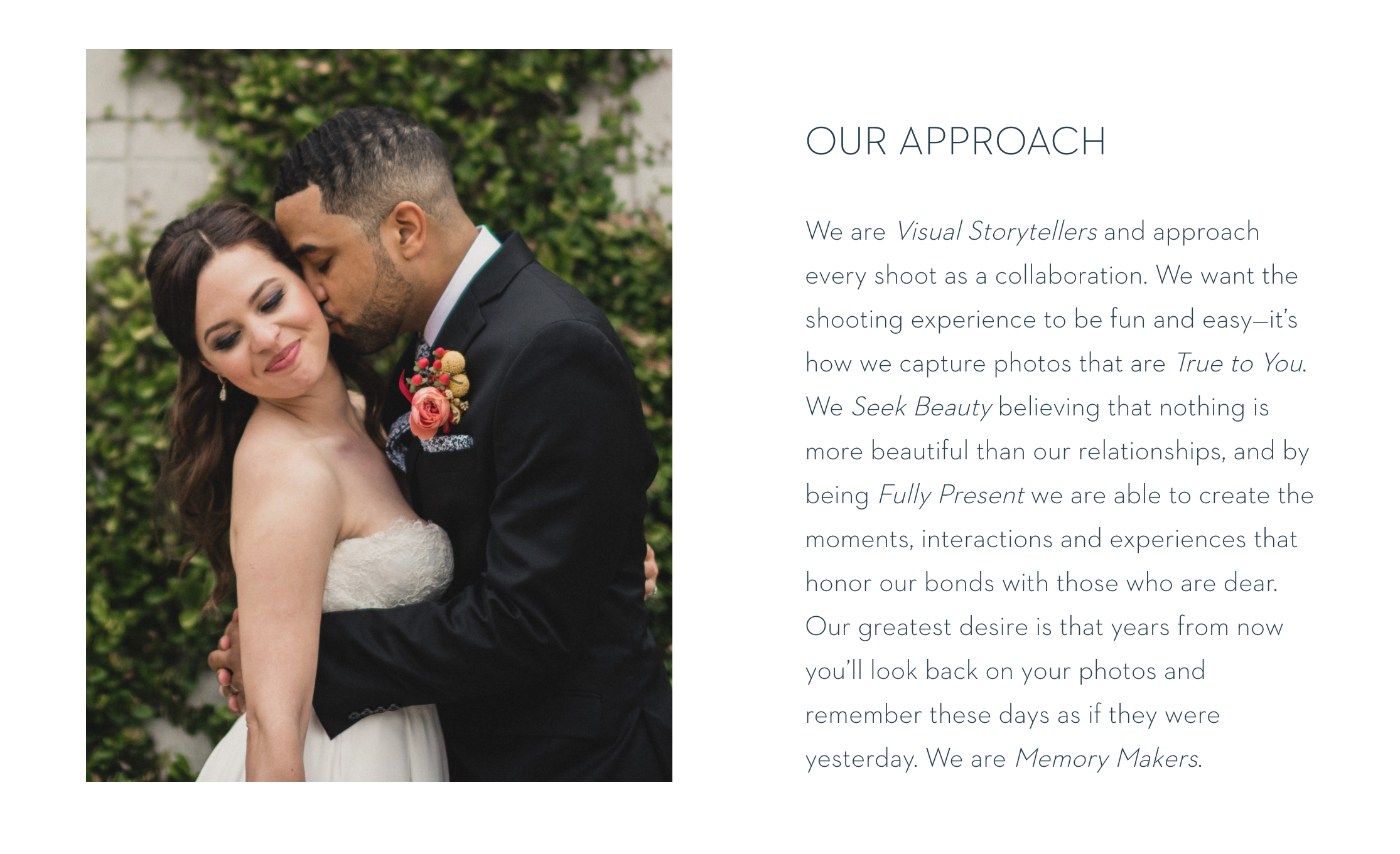
Source: https://nexttomestudios.com/
A simple left-aligned image with text on the right. Classic and visually appealing. I would personally add at least one paragraph break in that chunk of text to make things easier to read.
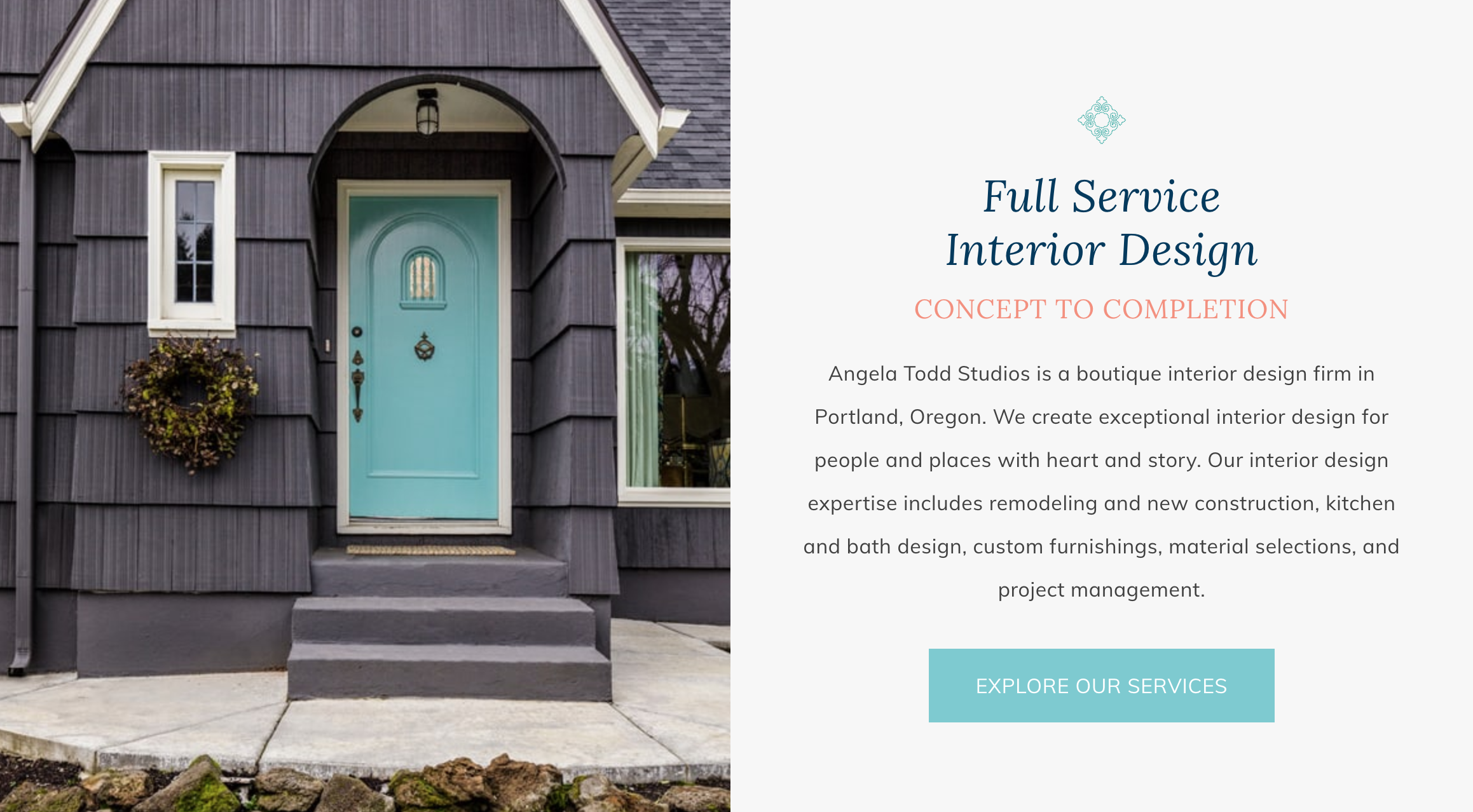
Source: https://www.angelatoddstudios.com/
I like the use of the header and subheader here before the paragraph text. There’s a subtle grey background behind the text which helps this section to stand out.
I also love seeing a call-to-action button showing visitors where they can find more information on this particular topic.
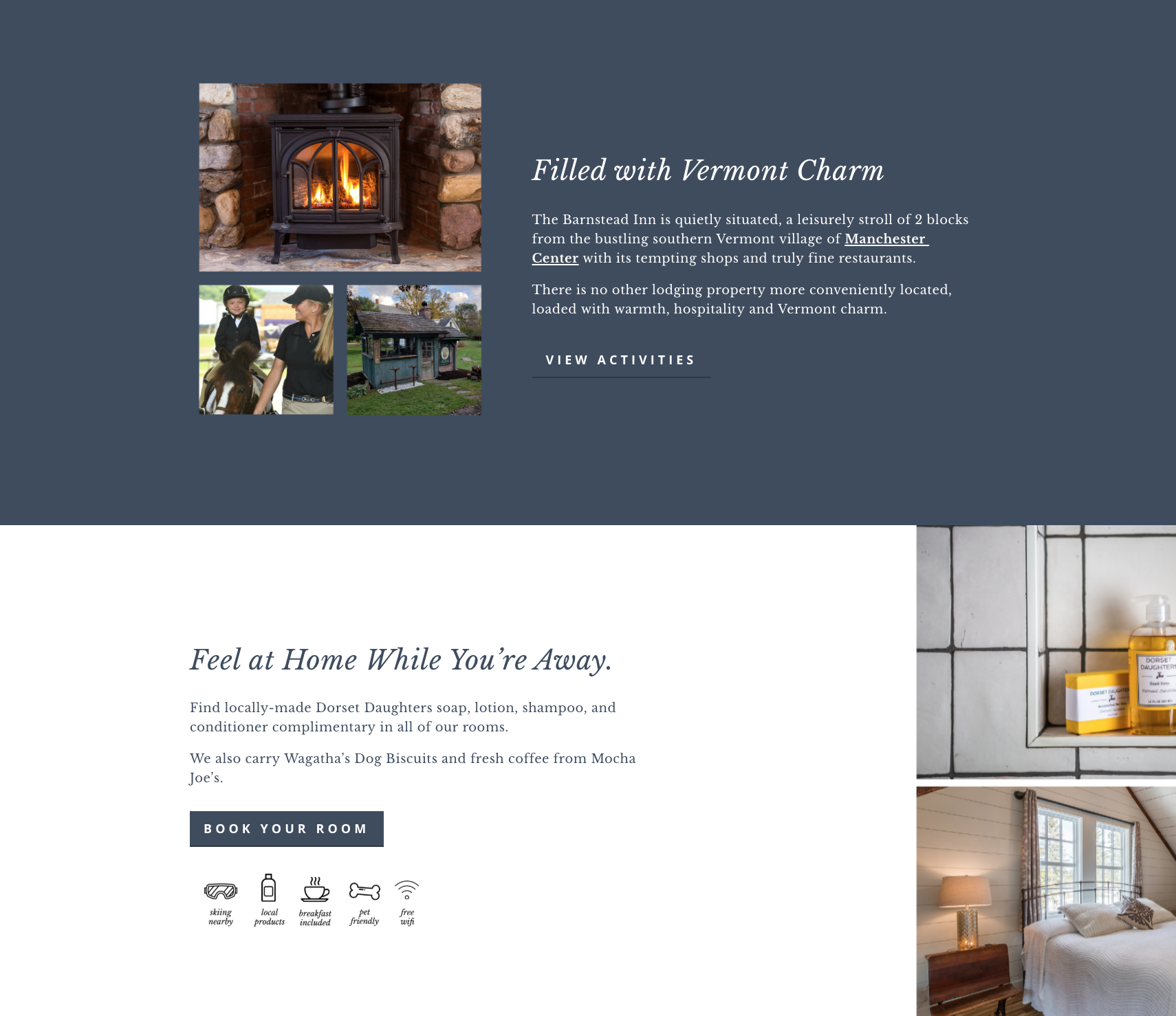
Source: https://www.barnsteadinn.com/
Here are what two sections look like on top of one another on a site, I recently built for a small boutique inn. I used a solid dark blue background color here to break up a mostly light colored page.
The section below is in stark contrast, while keeping with the same general color scheme. Each section also has a call-to-action button linking the visitor somewhere else to get more information.
Looking for help with SEO? Did you know you can hop on a call with me to get my eyes on your website with a one hour collaborative consultation. Together we’ll work on your website one-on-one and come up with a strategy you can use moving forward. Book your SEO Power Hour here.
Need help designing a better homepage?
Send us a message and let us know what you’re struggling with when it comes to your homepage design and SEO.
You don’t need to compromise on one to make room for the other. The two work together in tandem.
Galen Mooney is the founder of Local Creative, a boutique web design studio crafting elevated websites for small business owners and creatives with a focus on connection, clarity, and growth. With over a decade of experience in design and SEO, she’s partnered with hundreds of creative brands to build custom Showit, Squarespace, and WordPress websites that build trust and momentum over time.
