Behind the Scenes of Designing a Website For An Elopement Photographer
Capturing elopements is a special part of photography. It calls for an artist who can turn intimate, adventurous moments into beautiful images. Just like these unique stories, an elopement photographer’s website should feel just as personal and inspiring.
In this post, I’ll walk you through the redesign journey of Amanda Kluesner Photography, a West Coast-inspired adventurous elopement photographer’s website. From the initial website design to the strategy and unique features, we’ll explore what it takes to build a site that aligns with a photographer’s vision and clientele.
Note: there may have been some changes to the site since the design was originally completed by the client.
Ready to Work Together on Your Website?
Click here to fill out our contact form and get in touch.
About the Client: Amanda Kluesner Photography
Meet Amanda – the wanderlust-fueled soul behind Amanda Kluesner Photography. This Salt Lake City native caught the travel bug early and hasn’t looked back since. She kicked off her photo journey back in 2010 with a trusty Canon Rebel. Now? She’s living the dream, cruising the West Coast in her van, camera always at arms length. When she’s not freezing time for eloping couples, you’ll find her hiking up a storm or chilling with her favorite podcasts. Oh, and her home base? The stunning Lake Tahoe – not too shabby, right?
Website Design Inspiration
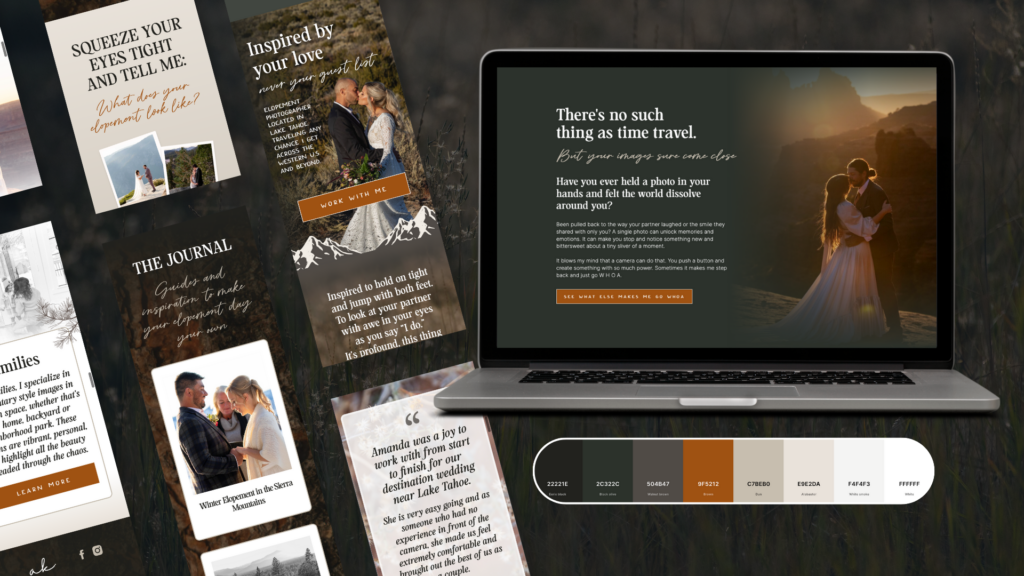
Amanda’s website design is deeply rooted in her connection to nature and her love for adventure. Living a nomadic lifestyle as a photographer traveling across the West Coast, her design is inspired by the natural beauty of Lake Tahoe, where she’s based, and the rugged, serene landscapes she frequently captures. We used earthy tones like greens, browns, and creamy neutrals to reflect the towering Sierra mountains, the pristine blue waters, and the natural elements that dominate her elopement locations.

The aesthetic is minimal yet inviting, showcasing Amanda’s adventurous spirit while keeping the focus on the couples she works with and the intimate moments she captures. Custom nature-themed elements add depth to the design, reflecting Amanda’s ethos of blending spontaneity with thoughtful planning. It’s a visual extension of her “leave no trace” philosophy, celebrating the wild beauty of outdoor elopements while respecting the environment.
The Design Process
To kick off the design process, we started with a strategy call where Amanda and I discussed the vision for the website and the kind of couples she wants to attract. You’d be surprised how many clients come to me with a blank slate, so these brainstorming sessions? They’re pure gold for nailing down that perfect brand vibe.
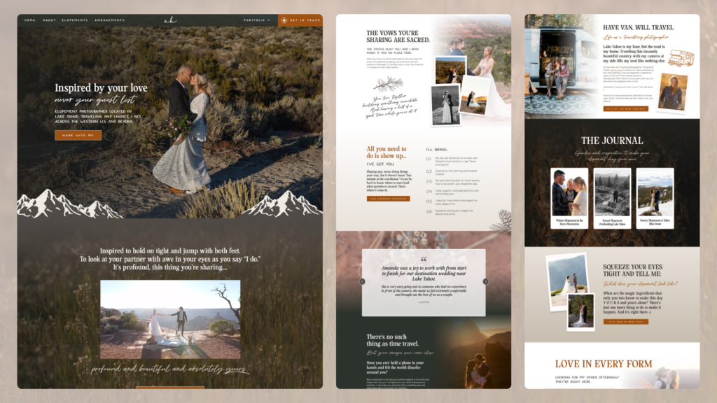
Once we had a strong grasp on the direction, the initial concept of the homepage was put together. I sent a video walkthrough of the design decisions and how they would help grow the brand. She enthusiastically approved the direction I showcased, allowing us to move forward and complete the design of the site, including portfolio pages, a blog, a lead magnet, and an automated email sequence built in ConvertKit. SEO was a crucial part of the final review before the site went live.
Why Showit Was the Best Platform?
We chose Showit as the website platform for this project because of the design flexibility and ease of use for Amanda who wants to manage the site on her own moving forward. Showit also allows complete flexibility of the mobile design which is super important as more and more traffic is coming from mobile devices. For visual brands, like photographers, Showit is a fantastic option.
Although Amanda’s original website was on Squarespace (a platform we still recommend for many clients), Showit provided the customization we need without the need for complex coding. This freedom allowed us to create a unique design that better aligned with Amanda’s brand.
Key Pages Built:
- Home
- About
- Elopement Photography
- Engagement Photography
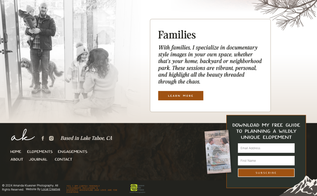
- Family Photography
- Elopement Portfolio
- Engagement Portfolio
- Family Portfolio
- Contact
- Blog/Journal
- Custom 404
- Thank You Page
Compelling Copy That Captures the Brand: Collaborating with Green Chair Stories
The copywriting for Amanda Kluesner Photography was expertly crafted by Green Chair Stories, a creative studio that specializes in storytelling and brand-building for photographers. Their services include full-service copywriting designed to authentically represent each client’s voice and vision.
This collaboration ensured that Amanda’s website not only looked visually compelling but also communicated her story and message in a way that resonated deeply with her audience.
Unique Features of the Website
This website was designed with several features specifically suited for an adventurous elopement photographer, including:
- SEO-friendly ad-free video player on the homepage to reduce distractions while highlighting Amanda’s work.
- Custom nature-inspired graphics to enhance the design’s West Coast vibe.
- A custom blog layout with clear calls to action, guiding visitors toward next steps.
- Email integration with ConvertKit, featuring a custom opt-in form and an automated welcome email sequence to engage potential clients.

Website Tips for Photographers
When it comes to website design or redesign, it’s crucial for photographers to identify what makes them unique. Your clients will get to know you personally, so your website should reflect your energy, vibe, and style of work. A cohesive brand and web presence create a lasting impression and build trust with your audience.
SEO Optimization
SEO played a significant role in the transition from Amanda’s old site to her new one. To ensure seamless ranking continuity, we:
- Maintained the URLs of pages already performing well in Google.
- Cleared redundant content and pages.
- Set up 301 redirects to guide search engines and users from outdated links to relevant new pages.
- Optimized on-page content with targeted keywords to boost Amanda’s visibility in search results.
The Impact of a New Website
Since launching the redesigned website, Amanda has seen immediate benefits. The site’s optimized structure has made it easier for her target audience to discover her, and the strategic SEO changes are already paying off with improved visibility and updated site links in Google.

The new design allows potential clients to get to know Amanda and her style, helping them decide if she’s the right fit even before reaching out. We’ll check back in 3-6 months to assess her search rankings and further optimize as needed.
Are you an elopement photographer looking to upgrade your website from boring to totally custom and 100% “you?” Contact me today, and let’s create a custom website that brings your unique vision to life, helping you stand out and connect with your ideal clients.

Galen Mooney is the founder of Local Creative, a boutique web design studio crafting elevated websites for small business owners and creatives with a focus on connection, clarity, and growth. With over a decade of experience in design and SEO, she’s partnered with hundreds of creative brands to build custom Showit, Squarespace, and WordPress websites that build trust and momentum over time.